How hard does your packaging have to work? When your customer is walking down the aisle, you only have two seconds to wow ’em. Not only are you fighting to grab their attention, you’re competing with all the other products on the shelf. Does your package have what it takes to stop the customer in their tracks? This series will look at all the techniques you can use to make the sale.
First impressions: Love at first sight.
We don’t mean to sound shallow, but in the first two seconds, looks are everything. You’ll have worked hard to get your product to this point—right here on the shelf. So don’t blow it with poor presentation. Your design has to work. You’ve got to entice, attract, and make the consumer fall in love.
Yes, it’s all about image in those vital first two seconds. How do you attract the eye?
Zig when the others zag.
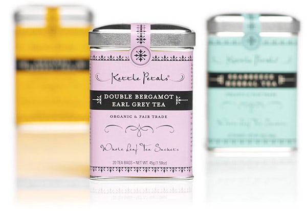
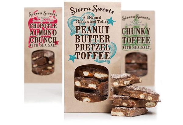
Do something different from competitors—don’t blend in by looking like what consumers would expect or what everyone else is doing. Embracing the unexpected adds an element of surprise and grabs the limelight. Our advice: research what competitors are doing, then do something completely different.
It’s all in the name.
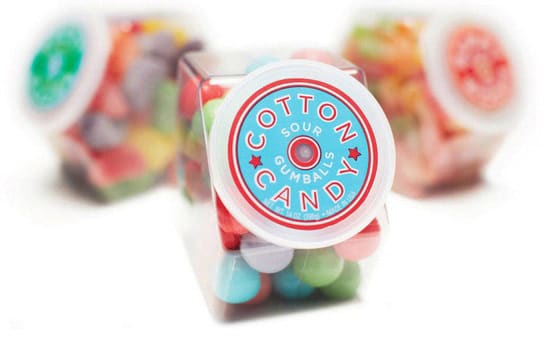
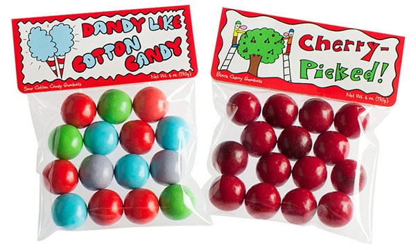
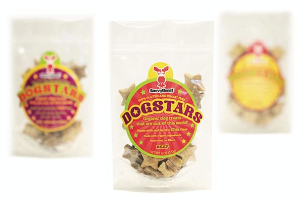
You want a unique product name. You want to keep the principal display panel (PDP) simple and easy to for consumers to process the information. So if you have a memorable product name or something funny, consumers are more likely to be intrigued. Again, the element of surprise and the unexpected works to your advantage here.
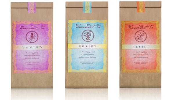
Show your true colors.
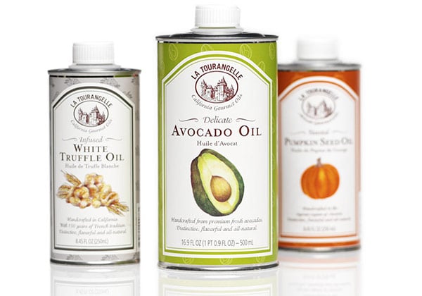
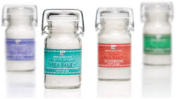
When you see blue, how do you feel? Calm? Serene? How about red? Do you feel energetic and bright? Never underestimate the power of color because it is a strong emotional connector. Simple, bold color, or unexpected color combinations all generate different emotions; so don’t hesitate to use color to stand out. If most products in your category scream with bright colors, it’s the perfect opportunity to use a simple, understated palette.
What type are you?
Sometimes it’s not just what you say but how you say it. Typography can literally give emotion to what’s being said. So have fun when appropriate, and always give careful selection to the fonts used on the package. Like colors, different fonts evoke different moods.
A way with words.
Your copy has to work double duty. It has to express the contents of the inner package on the outside. What is the flavor? How does it taste? How does it make you feel? Don’t just describe the product but tell the consumer how the product can enhance their lifestyle or solve a problem. Have fun but keep it simple and direct. Never be clever at the expense of being clear.
How does it all work together?
Remember to look at all design elements holistically. All the above must be carefully considered for effective presentation. For example, if you nailed down the design but the customer still has no idea of product benefits, you may be missing out on an opportunity. Remember, you only have two seconds to wow ’em.
In our next blog post, we’ll discuss what needs to happen after you get the consumers attention: they have to pick up the product.
Read the whole series:


2 responses to “The Whole Package: Keys to Effective Packaging Design (Part 1)”