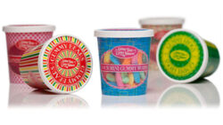
Healthy. All natural. Made with simple, quality ingredients. Maybe even organic and non-GMO. What do you think packaging should look like for this type of product? Are you thinking browns and greens, muted colors, kraft paper… to signify natural, healthy and good for you? Think again.
When natural products first started to enter the marketplace, it was the trend for them to look their part as described above. Now that natural products are becoming more mainstream however, it’s no longer necessary to portray them as the consumer assumes these products should look. The gourmet consumer expects products they shop for to be healthy and natural, and no longer requires the typical visual cues of looking healthy and natural to indicate such.
Playing the expected part in appearance may even work against a product. When a product looks as expected, there’s no surprise element—nothing stands out as unique, extraordinary or different. When a product has only a 2–3 second window on the retail shelf to capture the consumer’s attention, playing it safe by doing what’s expected is not the way to go.
When a product’s appearance is unexpected and makes a unique connection with the consumer in the small window of opportunity that it has, there is that surprise element, the “wow” factor. Something remarkable stops them and makes them pause to learn more. This piques their interest to further explore the product by picking it up—which is the next step in the package’s selling process.
Consider context as well. For gourmet products that are sold primarily in specialty food shops, the consumer is already shopping in a store that they trust has products fitting a certain type of category—further eliminating the need for the stereotypical natural look.
For natural products that are sold primarily in commercial grocery stores, it might still make sense for the product’s appearance to touch on some traditional visual cues of natural and healthy. The commercial audience is different, and commercial consumers may not otherwise realize that it is a natural, healthy product if they are looking for one. (Interestingly, the trend of consumers expecting clean ingredients from products is even starting to cross over into the commercial grocery realm.)
When a product’s appearance delights and surprises the consumer by making a unique connection, the product is put in a spotlight in the consumer’s mind. It stands out from the crowd, thereby breaking through the barrier in that 2–3 second window of opportunity. Additionally, once purchased and in the home, the product continues to captivate the consumer and further strengthens its connection to inspire the repeat sale.


