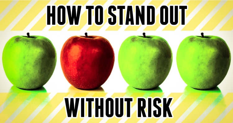
Putting your food product on the market can bring many challenges, but the number-one most common question we hear on clients’ minds is, “How do I get my product noticed so people will buy it?” You want your product to stand out, but standing out can also come with risks. Fears may arise such as, “What if the packaging is too different and turns away consumers?”

I have written previously about the dangers of a package that blends in with its competition. Conversely, standing out solely for the sake of standing out can harm sales as well—the design runs the risk of being aimless, misdirected, or even worse, turning away consumers. A loud design can be eye-catching but is it appropriate for the product? Does it resonate and connect with consumers?
Your product needs differentiation from the competition to succeed. A successful package stands out in two ways: 1) It catches the eye of the consumer authentically from among the competition, and 2) it clearly and succinctly communicates why your product is different. So how do you stand out without risk? Here are 3 key aspects to consider when you want to stand out without putting too much on the line.
1. Make sure the design and messaging are appropriate.
Whatever you do, make sure it is in line with the product, the audience and your goals. Specify a set of parameters and develop the design from that point. What to consider:
- The audience. Know whom you’re speaking to and what will resonate most with them about your product. Why should they buy it?
- The retail environment. Know where you’re selling: specialty retailers, supermarkets, club stores, or a mix? Make sure the design is suitable for that environment.
- The product. Consider the product’s purpose and how it’s used. For example: a snack product is going to look and speak differently than a product typically used as an ingredient in cooking.
- The price point. An upscale design can justify a high price point of a premium product, and too casual a design can make a product seem cheap. Strike the right balance to convey sophistication while making the product approachable.
2. Consider the container.
Can you differentiate from the competition by using an unusual container? Does it make sense or are you doing it just to be different? Before you answer, consider the following:
- What works best for the consumer? Never sacrifice usability for appearance. The last thing you want is a frustrated consumer due to poor performance of the container.
- Ease of merchandising. Maximize your shelf presence, but don’t take up too more much space than others in the category as it may present a problem for the retailer. Conversely, too small a package may be overlooked by consumers. Does your product need to stack?
- Transportation. A glass jar may look nice but it’s much heavier to ship, incurring higher shipping costs, and is more difficult to protect from breakage. Be sure you’re willing to accept these things before you commit to a heavy or fragile container.
(For more on container type, read our article here.)
3. Differentiate with color.
Color is usually the first thing that catches a consumer’s eye. You can use color to differentiate but consider its usage wisely. If you want to go deeper, here is an article I wrote specifically on color in relation to food packaging: Colors that Influence Food Sales. Here are some additional color considerations:
- Follow key flavor conventions: It’s usually best to stick with key flavor conventions for food products, which make it easier for the consumer to identify and understand the product more quickly. If you go against the norm here be sure to have a good reason for doing so, and know the risk you’re taking.
- Avoid color schemes that represent other brands. If a competitor is known for a certain combination of colors, you definitely want to steer clear of that and distinguish your brand with unique colors.
In addition to the above, we have also incorporated these other ways of standing out with our client projects:
- Go against the grain: If your competition is serious in message and/or design, could a fun approach work?
- Use a different image. If other products in your category use a photo, would an illustration stand out? Or if a photo best represents your product can you use a photo in a different way?
Ultimately we question everything as we develop a package. What conventions are worth sticking with and which ones can we change up? If other similar products are doing things a certain way, how can we do something different that is as or more effective? Blending in is the death of a package, so sometimes not taking any risk is the worst risk of all.


Another fantastic article!
btw, just wondering, I signed up for your email updates and got the “HOW TO MAKE YOUR GOURMET/SPECIALTY BRAND ROCK” questionnaire, is that “The Strategic Side of Packaging Design” or is that something different that is coming out later?
Have a great day!
🙂
Hi Meegan,
We’ll have it up later this month and we’ll be sure to make an announcement about it when it’s ready!
Sounds great! Thanks so much. 🙂 🙂
Hi Jenn,
Wish I could afford you, but thank you for all the info you pass through.
One day…
Stavros