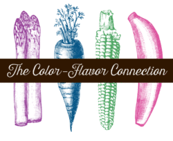
Have you ever noticed when you’re grocery shopping that certain colors represent certain flavors across many different products and brands? Some of course are obvious, such as blueberry is blue or purple, strawberry is red or pink and banana is yellow. But what about others like parmesan garlic, vanilla, cookies and cream? These also have color conventions that carry over to many brands and products. Here I’m going to detail why this is important and how it affects a food brand and purchasing decisions.
Many times in food packaging design, I advise not doing what everyone else is doing in a food category. You want your product to stand out and look different. A product that blends in by looking like other products in the category is not going to get noticed or have great sales (an exception to this is generic brand packaging, but we are not talking about that here).
However there is one place it where almost always makes sense to follow suit, and that is with the color used to denote the flavor or a product—particularly a product that can come in a variety of flavors. To understand why, we need to understand the selling process of a food package.
Packaging is the single most important selling tool for a gourmet food brand. Successful packaging:
- grabs the attention of the consumer from the retail shelf,
- instantly conveys what the product is, and
- then closes the sale.
(Going beyond that, once in the home, the package encourages the repeat sale.)
Steps 1 & 2 happen in a brief 2–3-second window. The more clearly the package conveys what the product is, the faster the consumer understands it, and the more likely they are to buy it. If there is any confusion in this short window, the consumer will quickly move on.
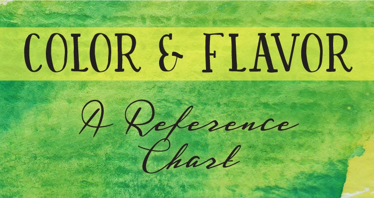
Visuals facilitate understanding. A successful package visually conveys an understanding of the product before any words are read, and color visually reinforces an understanding of flavor. As mentioned, many flavor color conventions are obvious, but here are common flavor conventions that aren’t so obvious:
![]() Honey Mustard:
Honey Mustard:
yellow or golden yellow
(also sometimes orangey-yellow)
![]() Sour Cream & Chive/Onion,
Sour Cream & Chive/Onion,
Parmesan, Parmesan Garlic and
Garlic: green
![]() White Cheddar and
White Cheddar and
Vanilla: medium/dark blue
![]() BBQ: red/burgundy
BBQ: red/burgundy
![]() Sesame: medium to dark orange
Sesame: medium to dark orange
![]()
![]() Coconut: brown or green
Coconut: brown or green
![]() Sea Salt: teal/turquoise
Sea Salt: teal/turquoise
![]() Cracked Pepper: gray/black/brown
Cracked Pepper: gray/black/brown
![]() Cookies & Cream: dark blue
Cookies & Cream: dark blue
![]() Chipotle: deep red/burgundy
Chipotle: deep red/burgundy
![]() Sriracha: bright red
Sriracha: bright red
![]() Habanero: orange or orangey-red
Habanero: orange or orangey-red
![]() Jalapeño: green
Jalapeño: green
I go more into the selling process or a retail food package in my FoodWorx speech—see the video here.
To go further, check out my article on food and color.
Questions or thoughts? Leave them in the comments below!