Part of my role as a food brand design partner is guiding and coaching our clients on best design practices in the food industry. I hear a lot of misconceptions when it comes to food brand logo design, and over the years I’ve found myself often explaining and educating on why these ideas are not a sound strategy.
In this article I’m going to go over common DOs and DON’Ts for food brand logos, so you can set your food brand up for success.
What’s the difference between a logo and branding?
Your logo is the mark of your food brand—think of it as the consistent anchor across your entire brand. Your branding is so much more than just your logo; it is every single consumer touchpoint of your brand: packaging, website, social media, marketing, etc. Branding is essentially the impression all your touch points leave on your consumer about your brand. [Related: Your Packaging Is More Important Than Your Logo]
Now that you know the difference between a logo and branding, let’s get to the Dos and Don’ts.
Logo mistake #1: Putting too much into the logo
I have heard people say, “We want to put this, this, this, and this into the logo.” Big mistake.
DON’T: You don’t want your food logo to be too intricate, complicated, or overly detailed, otherwise it becomes busy, weak, hard to implement and scale, and is less memorable.
DO: Simpler is definitely better with food logos. Simple, strong, and iconic stands out. It makes a solid impression, is memorable, and is easily recognizable. A simpler logo is also easier to implement across different touch points and applications, and to scale very small or very large.
Logo mistake #2: Not seeing the big picture of branding
Your logo is important, but the big picture of your branding is the most important.
DON’T: Don’t look at your logo concepts in isolation. Make sure your food brand’s design concepts are being developed in the larger context of the brand design. For example, you might think a logo concept looks too simple on its own, but when you see it within the whole branding, you see it in a completely different light.
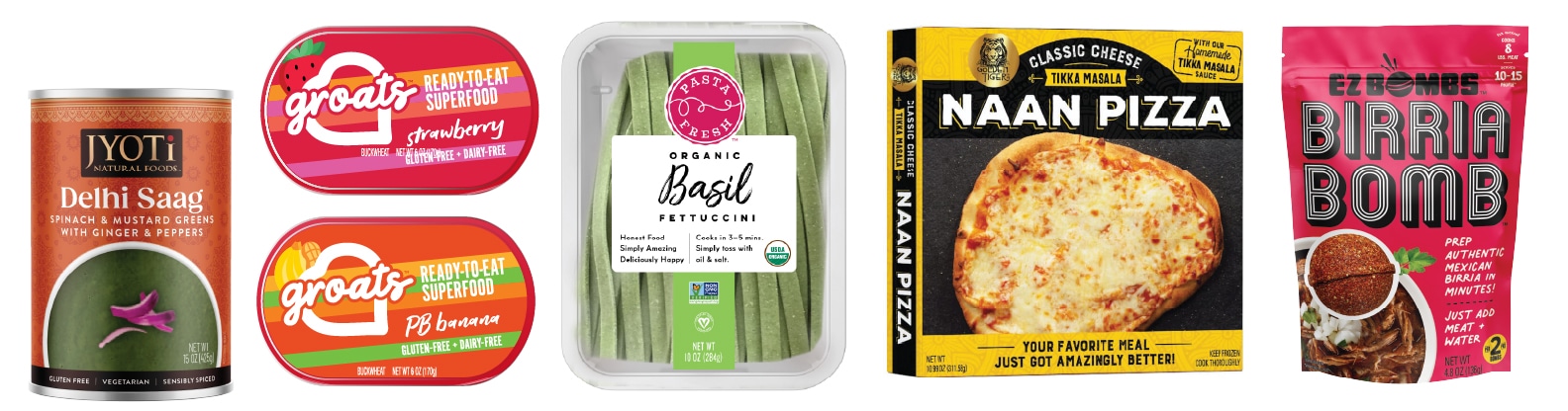
DO: Your branding should be unified, but not cookie-cutter. In other words, you want your touchpoints to be complementary, but not identical.
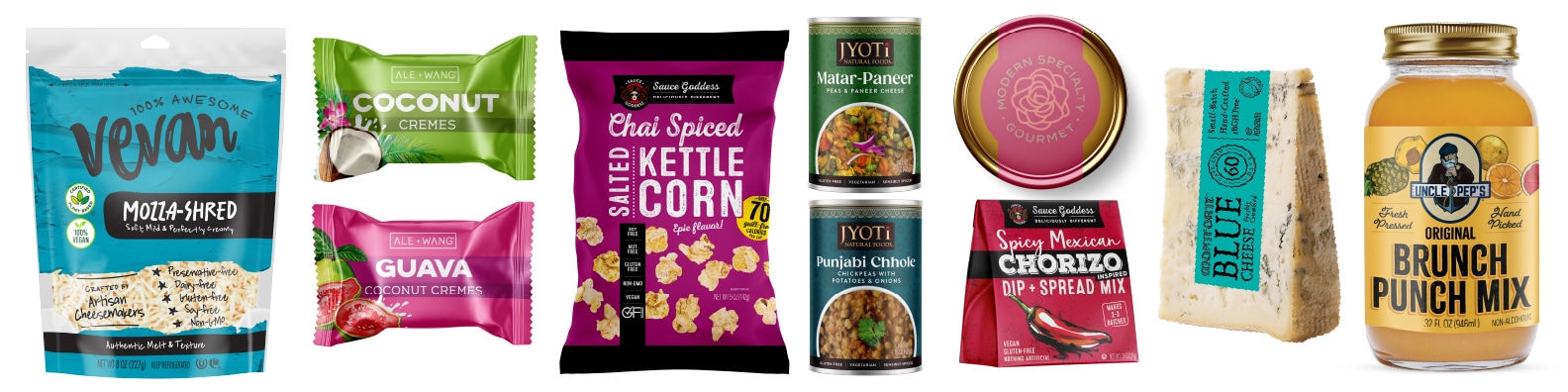
A great example of this is our Vevan brand design. The logo is consistent across all applications, whereas the look of the website is very different from the packaging. It all is complementary and driven by strategy, so it works together as an interesting and unique brand.
Remember, if all your touchpoints look the same, your branding becomes boring and expected. Vary it up to keep it interesting and exciting!

Logo mistake #3: Too many cooks in the kitchen
Too many people involved in the creative process can hinder creativity.
DON’T: When too many people are involved in the creative decision-making process, you get “design by committee.” There is usually too much fragmented feedback, because everyone has their say. You could end up with a sort of a Frankenstein logo that isn’t a strong solution. Yet, you might think it’s the right solution because everyone got a piece of what they wanted.
DO: Let your design team lead and guide the creative process. Give consolidated feedback and let the creative process determine the solutions. Don’t let your feedback “solve the problem”—rather, say what is and isn’t working for you, and let your design team take it from there.

Bonus tip: The cool factor!
Whenever I’m designing a logo, I like to give it the cool-factor test. Would people want to wear this logo on a T-shirt? Does it have that cool factor? Cool factor doesn’t necessarily mean one thing: Cool might be fun, exciting, elegant, bold, sleek… Whatever “cool” means for your brand, own it!
If you enjoyed this article about Food Brand Logos Dos & Don’ts, you might also like 10 Pitfalls to Avoid in Food Packaging Design.