You can watch this as a video above.
Food packaging design trends come and go. As a food brand, if you follow short-lived fads, your product blends in with all the others and quickly looks outdated. Even worse, it likely won’t sell well, because food design fads are often started for misguided reasons.
However, there are certain general food product packaging design trends that you DO want to follow to stay fresh and relevant.
This forecast contains 5 upcoming food packaging design trends—some are to follow and some are to avoid. It’s strategic insight that I’ve developed based on an assessment of:
- The current state of food packaging
- Strengths and weaknesses in the food industry right now
- What food consumers are looking for
- My expertise from specializing in food brand design for over 2 decades
Let’s take a look at this 2023-24 Food Packaging Design Trends Forecast, to help you stand out, be authentic, and sell your food product!
FORECAST #1: Be bold!
Trend to follow: YES
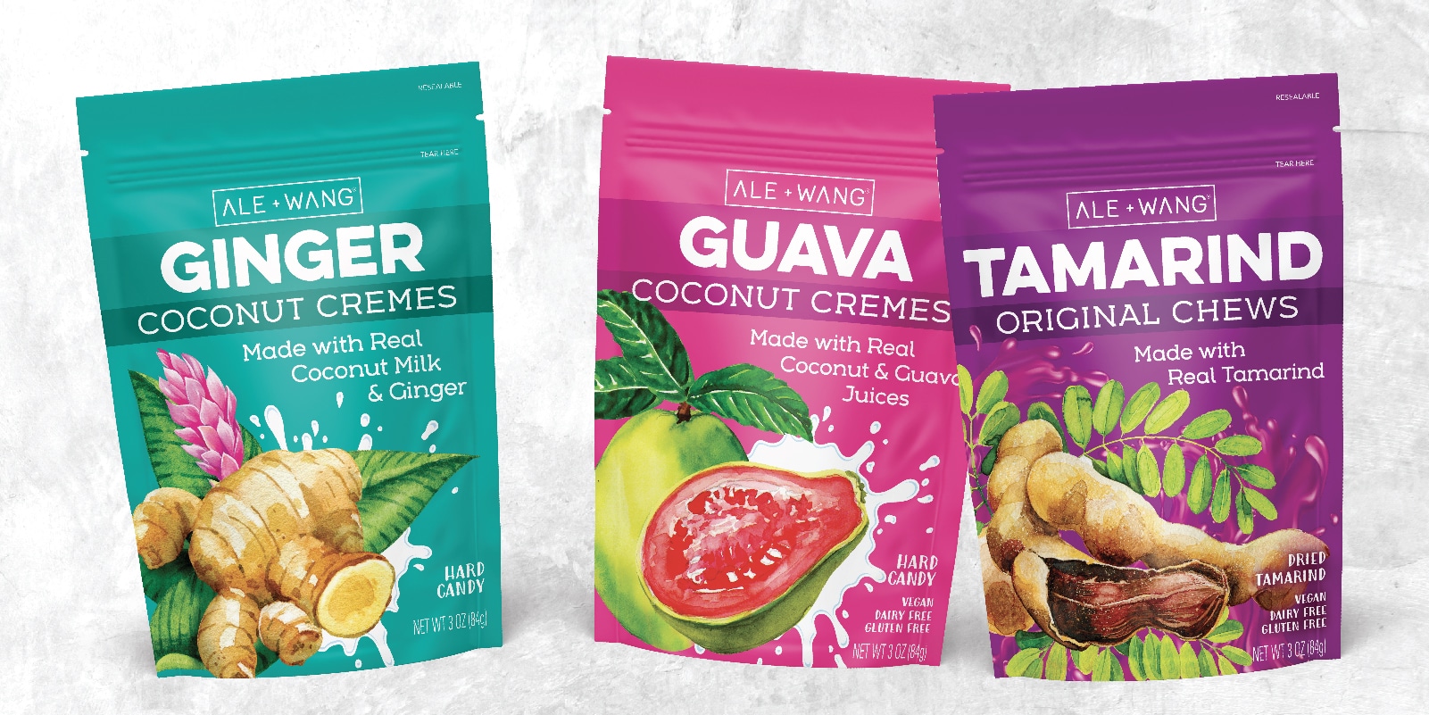
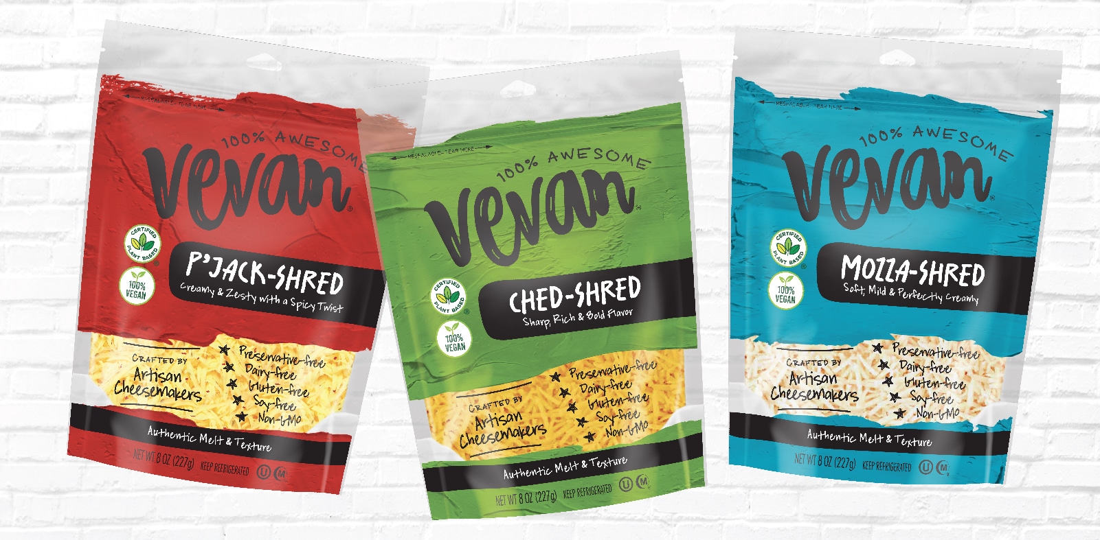
For so long, minimalism has dominated specialty food packaging design with stark, plain designs. It’s time to embrace Maximalism! What is the Maximalist food packaging design trend? Think of it as the opposite of minimalism. It’s fearless creativity—fresh, interesting, dynamic, and different. This could mean anything from:
- Using bold or unexpected: color, typography, or imagery
- Unconventional design
- Surprising messages
- Involving fun and whimsy
- Being your unique, different self as a food brand
Consumers are craving this freshness and excitement, particularly when discovering new or revamped food brands and products. Whatever you do should be authentic to be true to your own brand, and always rooted in strategy.
FORECAST #2: Move beyond mediocre
Trend to follow: YES
There is so much mediocre food packaging design out there. It’s no surprise, because there are so many websites where you can get cheap design from unspecialized or inexperienced designers. I have heard from many food brands that have done this and regretted it because it didn’t perform well. (Article on this is coming soon. Check out how to properly save money on food packaging design here.)
Food packaging is the face of your food brand. Packaging that looks boring is not going to go far in generating excitement about your food product. Food packaging that is truly creative—for a reason—really shines. Your packaging design and messaging should get your consumer excited about your brand and product at first glance, and beyond!
Hold your food brand to a higher standard, and make a proper investment in your brand by working with an expert food brand design partner that knows how to differentiate and push creative boundaries in a way that boosts sales and doesn’t harm them.
FORECAST #3: Refresh to stay relevant
Trend to follow: YES
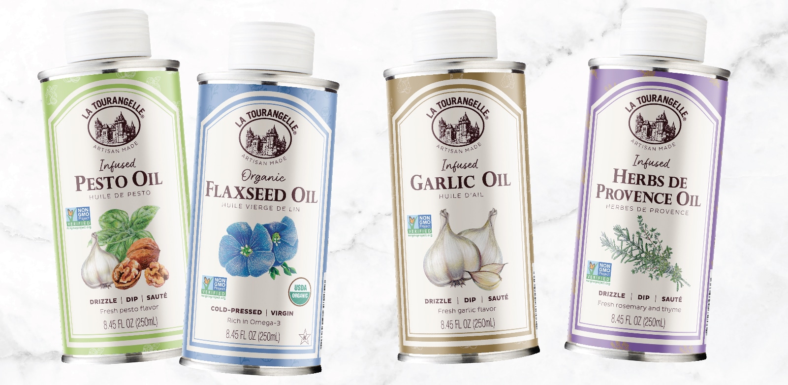
If your food product has been in the market awhile without any major updates, it’s time to assess your brand compared to the current market and refresh. In fact, this is something you should be doing on an annual basis. A food brand design refresh does not mean a new design. Subtle changes can yield great impacts. No matter how recognizable, well-known or iconic your brand is, if you’re not refreshing to remain relevant, then you’re going to look dated and fall behind.
Get on top of this situation before it starts negatively impacting you. There are so many newcomer brands hungry to disrupt a food category, and you don’t want to be next on the chopping block. Whereas newcomer brands may have an advantage of being new, an established brand that has been around for some time (whether years or decades) has the advantage of expertise and longevity, and the right kind of refresh can breathe new and exciting life into the brand in the eyes of the consumer.
Check out our recent La Tourangelle brand refresh for an example of this!
FORECAST #4: Packaging design that looks like it could be anything
Trend to follow: NO
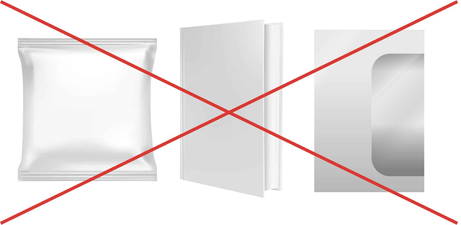
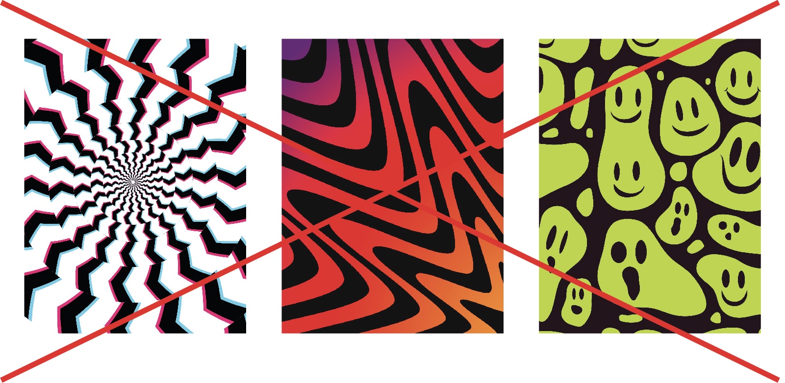
I’ve seen articles about how all book cover designs are starting to look the same: colorful abstract background with white text across it. We are starting to see this in food packaging too—not only this particular design trend, but also other designs that look like it could be anything—a book, a beauty item, an electronics product, etc.
At first impression, your food packaging should visually convey that it’s food—and be enticing—without having to read it. If it doesn’t, this creates a disconnect in the subconscious that makes it harder to process what the product is. The harder a consumer has to work to understand what the product is, the less likely they are to buy the product. It may seem trivial, but when your product only has a second or two of opportunity, everything counts.
FORECAST #5: Creativity for the sake of being different and wacky
Trend to follow: NO
I am seeing more food packaging that has unusual design, but comes at a sacrifice to strategy and understanding—and therefore harms the sale. These designs might have:
- Unappetizing colors
- Lack color
- Look overly plain and unexciting
- Have the wrong elements emphasized
- A design that does not connect with the product
It seems like these designs are trying to be different for no apparent reason or strategy. They aren’t authentic or true to the brand or product. I often see them end up in discount grocery stores where brands slash costs to try to liquidate products that don’t sell well.
Your expert food brand design partner should start with a proper strategy and let that guide the creative development. That way, you find authentic ways to stand out that make sense for a reason without harming sales.
Conclusion
It’s an interesting time in the food industry where there are still a lot of challenges, yet consumers are craving new, different, fresh, and innovative food products. Your food branding and packaging design are not static things—they need to be maintained and updated in order to bring continued success. What that means for your brand is entirely unique to you. So consider these Dos and Don’ts as you move forward in the upcoming year and see how they can apply to your food brand.
Stand out fiercely and authentically, but always with strategy to be sure you’re mitigating any risk. And remember to have fun with it!
Not sure where to start with establishing or updating your food brand? Get started with us here.
