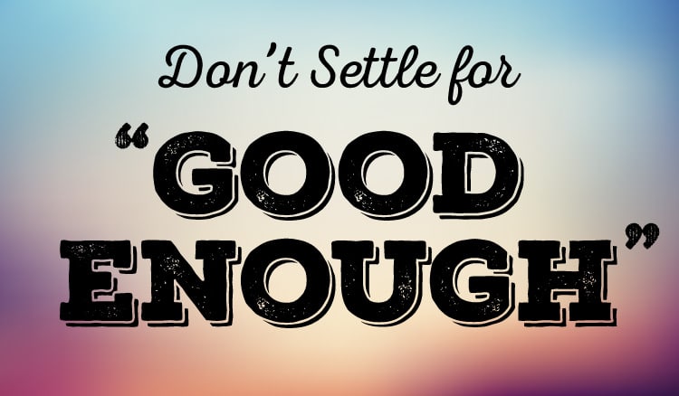
Every year I look forward to attending the Fancy Food Show. Walking around the show this year, very few packaging designs caught my eye. Quite honestly, this took me by surprise. I saw many missed opportunities that didn’t fully utilize the packaging as a marketing platform, as well as some fundamental design flaws. I began to wonder, have I become more discriminating in evaluating packaging? Or, have more people begun to settle for “good enough?”
Perhaps this is coinciding with the superabundance of low-cost design websites out there. I have heard more and more from brands who approach us for a redesign, that their packaging or logo (which they weren’t happy with or wasn’t performing well) was done by an inexpensive online source. They are frustrated that they didn’t do the design process right the first time and now have to step backwards and start over with a redesign from scratch at an inconvenient time.
When you hire someone not specialized or experienced in food packaging design, you may think the end result looks nice or that you got a good deal on the cost. Ultimately, you are likely to end up paying much more in lost sales and opportunities from underperforming packaging. A common misconception is thinking that, because you don’t know how successful your product will be, you don’t want to invest much in the packaging design process. You think you can skimp and get something on the cheap that will suffice. But at the same time, by not investing in the power of design, you’re not giving your product its best chance at succeeding.
The packaging must be a workhorse for attracting interest and closing sales (and encouraging repeat sales)—be it on the shelf, online or in the consumer’s home. Packaging should be engaging and informing, and should strengthen the emotional connection with your audience. [Related: 8 Things You Need to Know Before Selling Your Food Product Online.]
Is it really a surprise then, that much of what I saw at the show didn’t look effective or engaging? As a designer and advocate for the design and food industries, I hold my work, my team, my clients and my vendors to high standards. We are all in it together, as a team, fully committed 100% from start to finish, working toward the highest possible outcome—for your product to be a success in the marketplace. When you engage in this way and go all in, you are investing in and maximizing your product’s success.
The full packaging design process is an insurance policy to hedge off as much risk as possible and poise the product for as much success as possible. It should involve assessing the target audience, retail environment, competitors, brand values, consumer values, FDA compliance and much more. When you approach your packaging this way, you can be assured that it will be done right the first time, it will be a workhorse on the shelf, and you will be minimizing risk.
Whether you are doing it yourself, using a design site or working with an experienced professional, here are some trending ‘design pitfalls’ to avoid:
- Logos are too big (and getting bigger). Your logo should not be the most prominent element on the front of the package. The product name is what the consumer needs to see first. If consumers don’t know what the product is at a passing glance, that means lost sales for you.
- All the products in a line look the same. If you have more than one product in your line (such as different flavors), the products should look similar yet easily be distinguishable from each other. This could be a prominent color cue, image or other design element that changes per product, or all of the above. If the consumer has to scrutinize to see which product is which, you’re making the consumer work too hard to understand the most basic thing about the product—what it is. In that 2–3 second window, confusion or making them work too hard translates to a lost sale. In the home, products that look too similar can lead to product confusion—using the wrong product—resulting in consumer frustration, which is a brand-killer.
- Overly clean. Minimalist, “clean” design has been trending for awhile now but I’m seeing more and more examples of it being taken too far. The design becomes so minimalist that all the character and emotion is stripped away. This leaves the package looking uninteresting, unexciting, austere and standoffish. If this product were a person, would you want to talk to him or her at a social event? [Related: Think about your product as a person.] Many want to portray their food product as premium, and mistakenly think that looking elitist is the way to achieve this. When your product lacks personality and energy, there is not enough visual impact to capture attention in that 2–3 second window. Your product must be approachable.
- Misdirected personality. On the opposite extreme, I saw many designs that were overly boisterous, and the look didn’t seem to align with the nature of the product. It appeared as if these designs were developed without regard for the product’s character and personality. When developing a new look for your food product, it’s essential to understand the nature and experience of the product, as well as the intention behind it and why it was developed. These are all important factors that inform and shape the creative direction of the design.
I hope this gives you some insight into your own packaging and what to look out for when launching a product. You’ve put your heart and soul into creating your products, so keep that level of commitment and investment throughout the design process by investing in your products’ success. Now, as you bring them to the shelf, let that inspiration and passion be at the forefront of what consumers see.


Jenn, I agree with you on all “trending pitfalls.” I’ve even seen cereal boxes that are minimalist–now that’s a real no-no. I want something to read while I’m eating breakfast! What caught my eye was your term “good enough,” stating that too many designers and unknowing clients are settling for such. Which reminds me of a favorite slogan from decades ago. I want to say it was AT&T but I’m not exactly sure. It goes “Good enough isn’t.”
Reading cereal boxes while eating breakfast as a kid was my first real engagement with food packaging! So much opportunity there. 🙂
Really insightful post! Always love reading your take and learnt alot.