Well-designed food packaging can dramatically increase sales and the success of your food product. We’re sharing 20 examples of our best food packaging design—and the strategies behind them that make them effective. Successful package design isn’t just about looking attractive or following the latest design trends, it’s about motivating shoppers to pick up a product off the shelf, or click on its thumbnail online or in social media, and put it into their shopping cart—physical or virtual. You can take these insider food packaging industry strategies and impart them into your food brand packaging, or find out what it’s like to partner with us.
What is the best packaging ever? We think the following examples are pretty awesome. Read on to find out tips for designing great food packaging.
Whisps Cheese Crisps Snack Pouch Packaging Design
Designing a fun snack brand — Best Snack Packaging Design
Whisps are light, airy, 100%-cheese crisps. What is the best strategy for creating brand identities that stand out? This big, iconic logo uses custom hand-lettering to be approachable, memorable and whimsical, while drawing attention to the package from a distance. The product is branded as a fun, good-for-you snack. The white background echoes purity while the bright colors in the branding convey fun. For the flavored variations with spices, the large ingredient illustrations distinguish the different varieties without having to rely on reading the text. This product entered the market with a different design; after our rebranding, sales rose dramatically. Whisps Cheese Crisps
Dip Mixes Packet/Box Packaging Design
Encouraging impulse buys — Best Spice Packaging Design
Spice Goddess packs a lot of flavor in a small package. These mixes are sold in retailers like Home Goods and TJ Maxx as an impulse buy, as well as online. Our challenge was to make the small package stand out. The type of packaging you choose for a product can make a big difference in terms of standing out. These custom-shape boxes are eye-catching together with the bold color and the background textures, which convey an artisan appeal. What are the best fonts for packaging design? In this case, a bold font that is visible from afar (in stores) and at thumbnail size (online). We included the key selling points on the front of the package so a customer can make a purchase decision without having to flip over the package to find out more. Although, the back contains more information to motivate the sale, of course. Sauce Goddess
Shēto West African Hot Sauce Jar Condiment Packaging Design
Introducing a Ghanese product to the mainstream market—Best Condiment Packaging Design
What are the most impressive packaging designs? The ones that stand out dramatically in a bold way. This hot sauce is a traditional condiment in Ghana, located in West Africa. The brand launched in the US in ethnic stores with consumers already familiar with the condiment, but the primary focus was introducing this specialty food product to the mainstream US market. We took our inspiration for the bold colors and stripe detailing from West African clothing. The bright pink of the label with strong lettering is a bold “hello” to new customers. A background texture adds depth to an otherwise clean design, and speaks to the layered flavor notes in this versatile condiment. To familiarize new consumers with this product, the usage is clearly stated on the front. Customers are further educated in product use and recipes on the back of the package with color icons interspersed with the text. Volta Foods
Cookies Pouch Packaging Design
Improving an established brand—Best Cookie Packaging Design
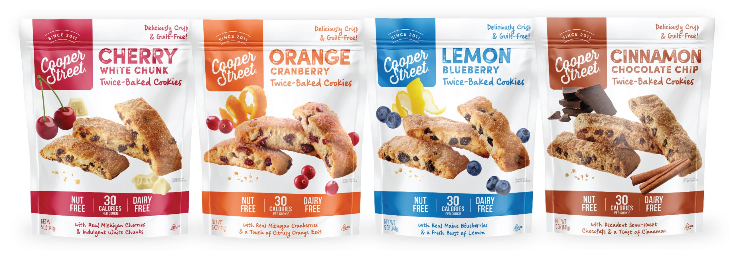
Cooper Street Cookies is a family-owned business with national reach. We recently gave the brand a redesign to create greater visual impact and to optimize sales. The oversized, high-quality photos grab attention and communicate the use of natural ingredients in the product. The bold color is fun and fresh while white conveys the purity of the ingredients. The original packaging designs were busy, with product callouts presented in a disorganized manner, which obscured the important messaging. We simplified the key callouts, placing secondary selling points on the back panel. A brief brand story connects the products to the family-owned brand. The bottom gusset of the pouches adds a touch of surprise with color blocks and an unexpected message. Cooper Street Cookies
Coconut Creme Candy Pouch Packaging Design
Standing out in the crowded candy category—Best Candy Packaging Design
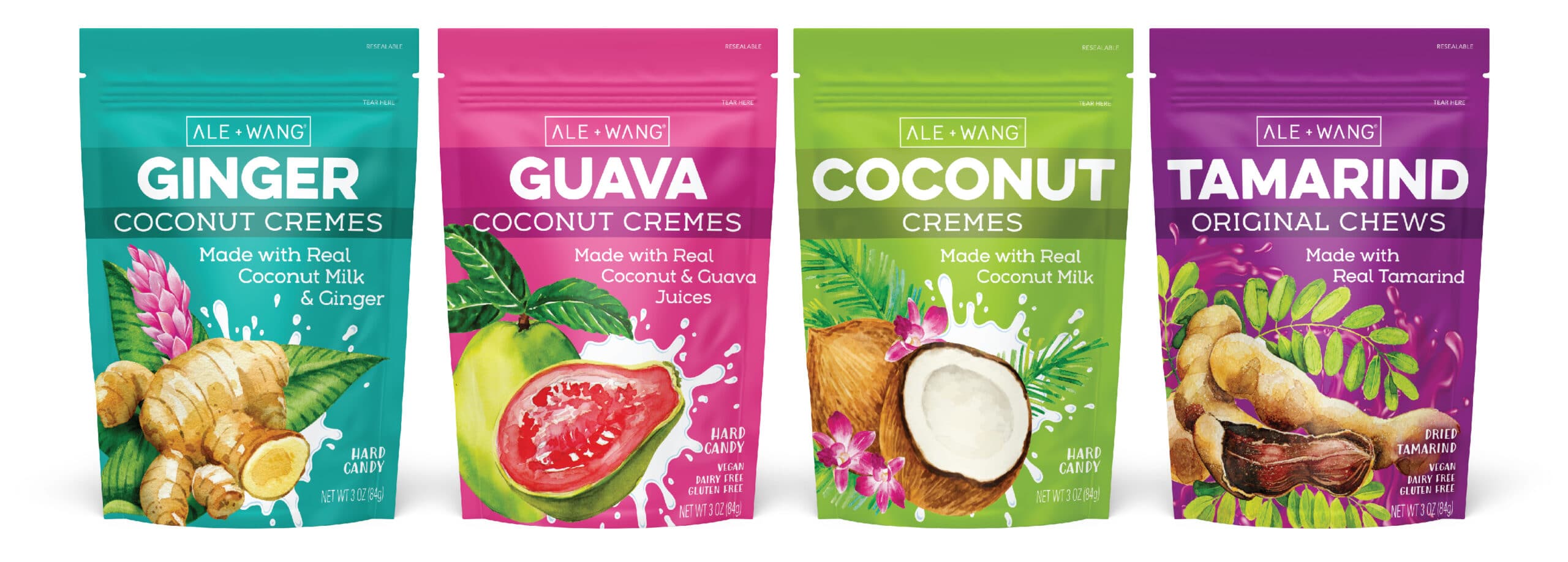
These better-for-you candies are made with real, quality ingredients—a healthy indulgence. How did we communicate this in a millisecond? With big, fresh, colorful illustrations of ingredients. Bold text reinforces this message. (We believe you can never be too obvious.) The splash of coconut milk conveys a sense of movement and energy to add an element of fun. A window in the back reveals the individually wrapped candies inside (which are super cute!), and is an excellent strategy since the front of this food packaging design focuses on ingredients. Ale + Wang
Natural Drink Mixers Bottle Packaging Design
Cocktail Mixers, Bloody Mary Mixers, Margarita Mixers
Conveying natural and premium ingredients while differentiating subcategories—Best Drink Mixer Packaging Design
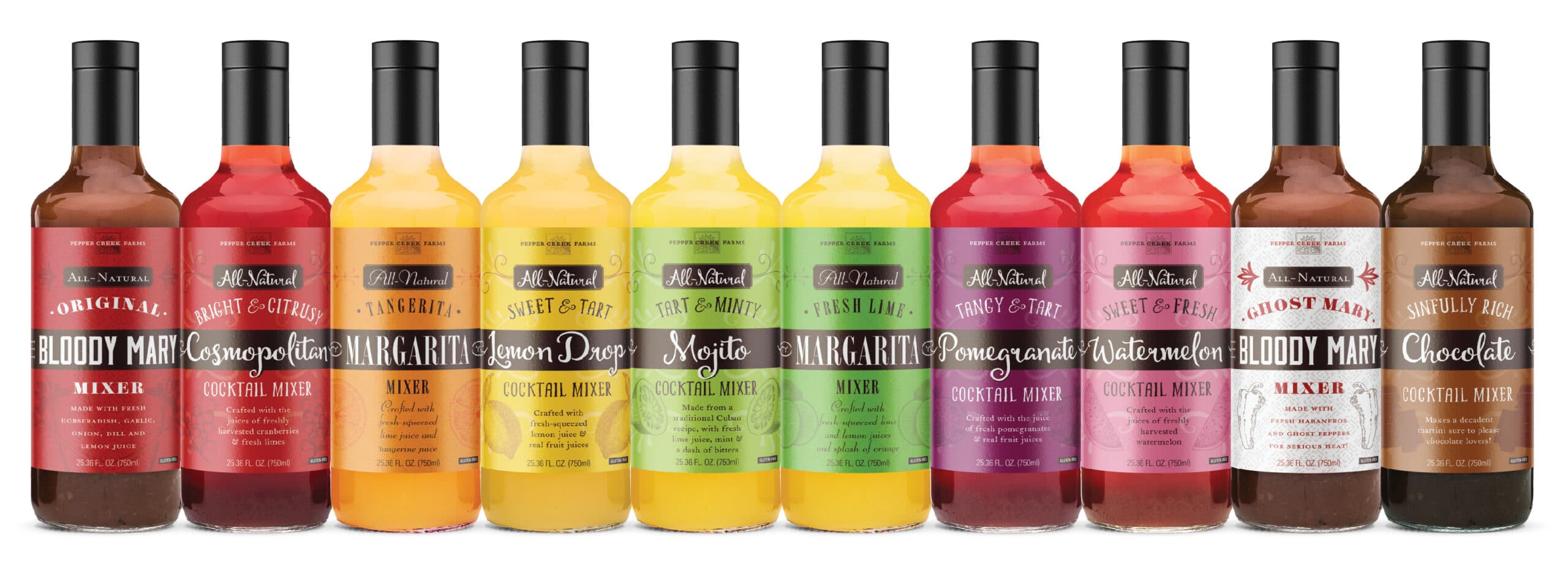
Most drink mixers are loaded with artificial colors and flavorings. These all-natural drink mixers provide a better-for-you alternative. We used vintage-inspired images to highlight signature flavor ingredients and to add a nice contrast to the fresh, modern design. There are ten varieties in this line of drinks; the choice could easily overwhelm shoppers. We created subcategories to make it easier to navigate choice: Bloody Marys, Margaritas, and Cocktail mixers. They each have a similar design but use different fonts to offer nuance between categories. Each flavor is represented with its own unique color, while maintaining a cohesive look across the brand. Pepper Creek Farms
Korean Comfort Food Frozen Box Packaging Design
Introducing Korean comfort food to the U.S. market—Best Frozen Food Packaging Design
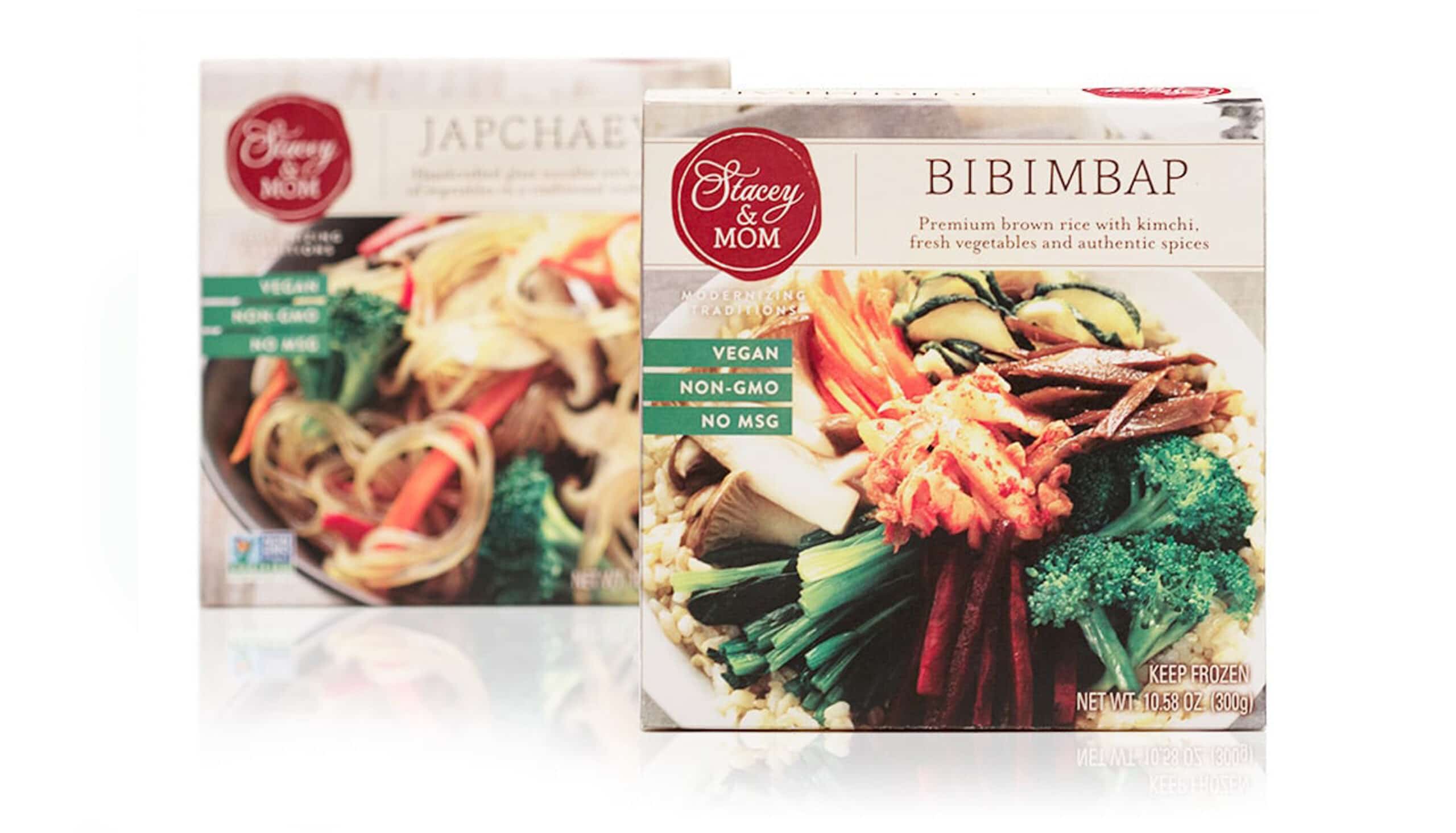
A mother-daughter duo took traditional Korean recipes and modernized them a bit with premium ingredients. We used large photos to convey the quality of the ingredients—a very effective strategy when introducing customers to an unfamiliar cuisine. It’s essential to invest in high-quality food product photography if using a product image; poor-quality photos do not conjure an appetizing look and will most definitely result in lost sales. The Korean name of each dish is followed with a clear description to further educate customers. Nutrition callouts are featured for each dish—vegan, non-GMO, no MSG—but, for simplicity, no other messaging is included on the front. This approach also subconsciously reinforces the fact that these products feature a clean ingredient list. We used the back panel to convey additional information on each dish, and included a brand story for emotional connection. The logo is reminiscent of a wax seal, which speaks to the heritage and tradition of this brand. Stacey & Mom
Tea Tin Packaging Design
Herbal Tea, Black Tea, Green Tea, White Tea, Oolong Tea, Purple Tea
Breaking the category mold—Best Tea Packaging Design
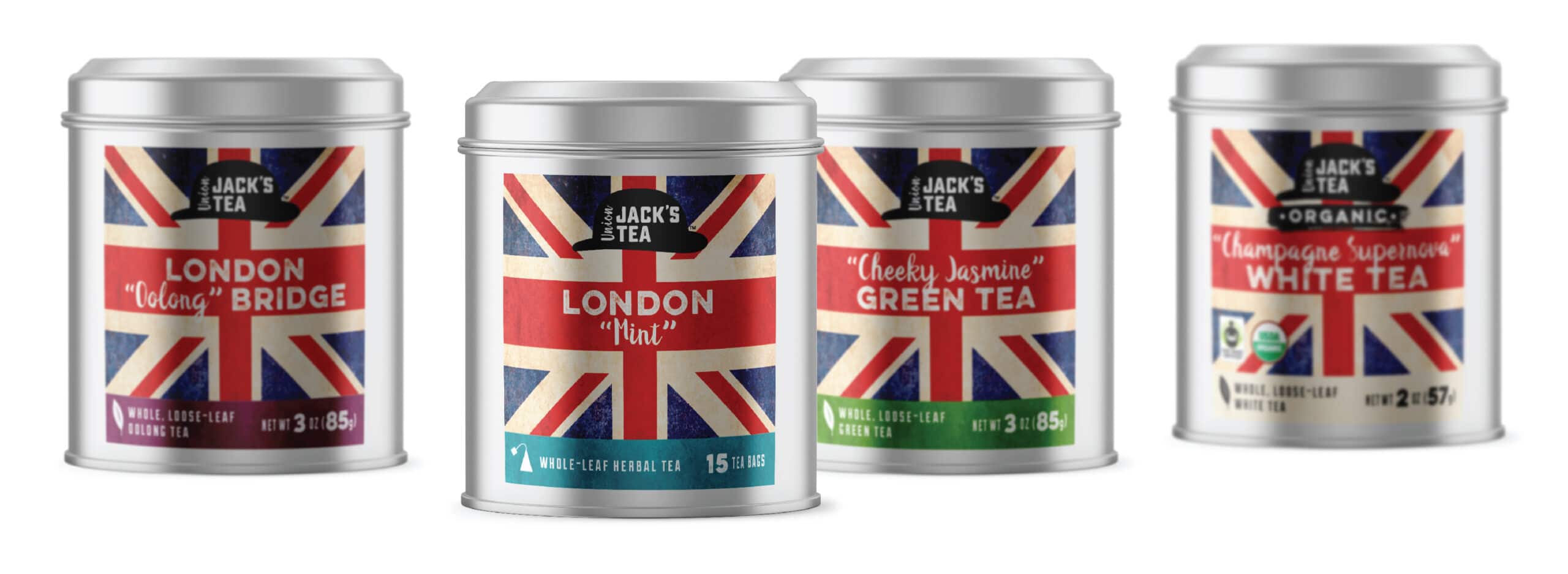
Tea traditionally tends to be a prim and proper category. Union Jack’s Tea boldly breaks the mold by sporting a rocker vibe with a hint of British Invasion rebellion. We designed the logo to give a nod to British tradition with a bowler hat while the distressed British flag recalls the revolutionary air of early punkers. The cheeky names are communicated in a modern typeface combined with a handwriting font. And nothing says British tea more than a classic tin. Unexpected signature ingredients like blue cornflower offer twists on traditional teas. The backs of the packaging offer whimsical descriptions interwoven with stories of the brand’s namesake “Jack,” together with classic icons of british culture. This was a fun design project! Union Jack’s Tea
Avocado Oil Packaging Design
Strategic packaging design for retailing in Costco—Best Avocado Oil Packaging Design
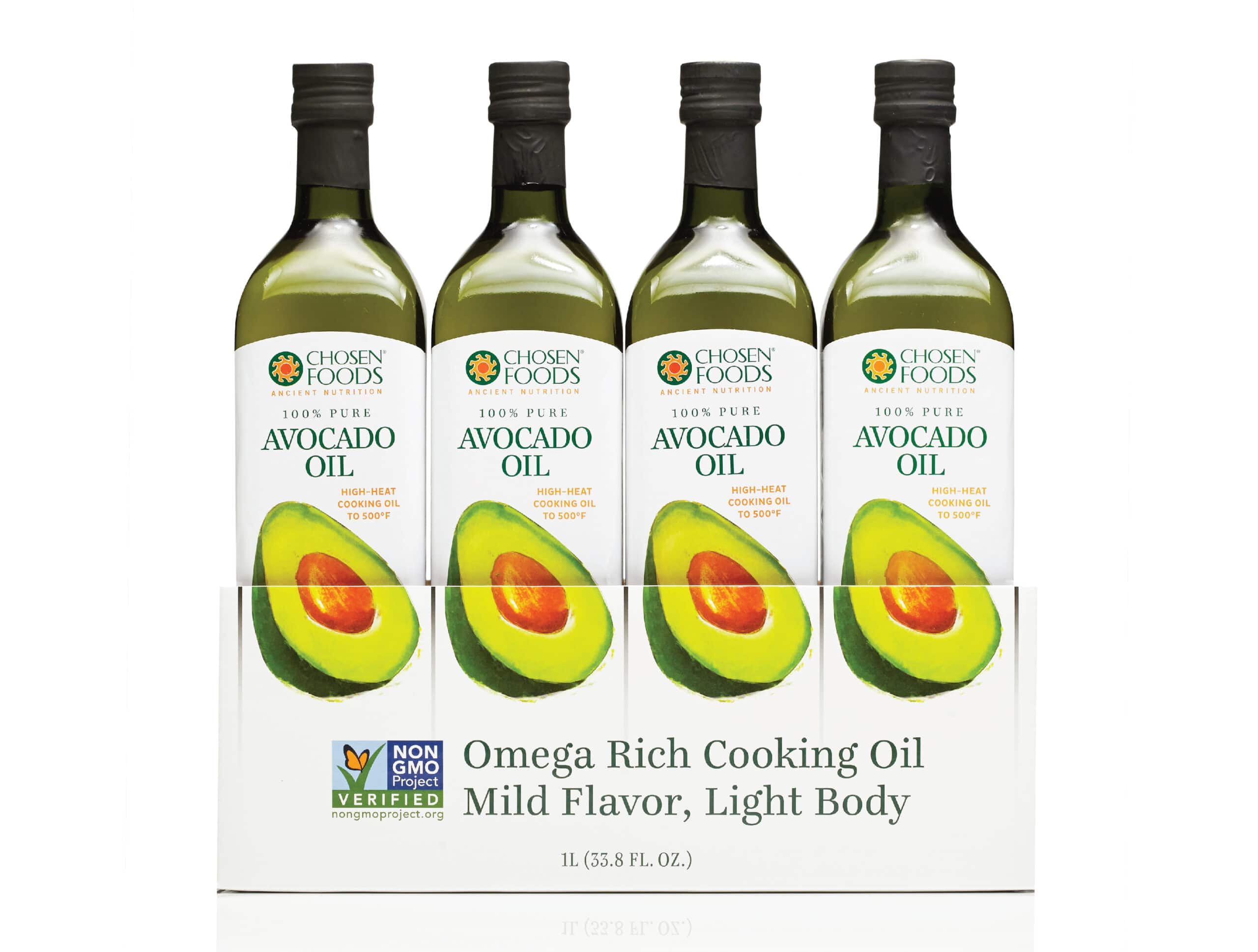
Our challenge: the display box for this food packaging to be sold in Costco covered up half of the product bottle. Our solution: design the box as a continuation of this label design! Four large, colorful avocado images complete the image on the box to grab attention from a distance, which is essential in club stores like Costco with dimly lit aisles. Large type communicates key selling points about this oil without repeating the product title or brand logo, since that is already clearly on this large avocado oil bottle packaging design. We did not repeat the product name or logo; instead, we let the iconic avocado illustrations do the talking with the key selling points. The modern, clean packaging design stands out and conveys the simplicity of this versatile and healthy oil. Warehouse package design requires that you modify graphic design for less-than-optimal conditions for space and lighting. Chosen Foods Avocado Oil
Biscotti Cookie Packaging Design
Differentiating in the crowded cookie category—Best Giftable Food Packaging Design
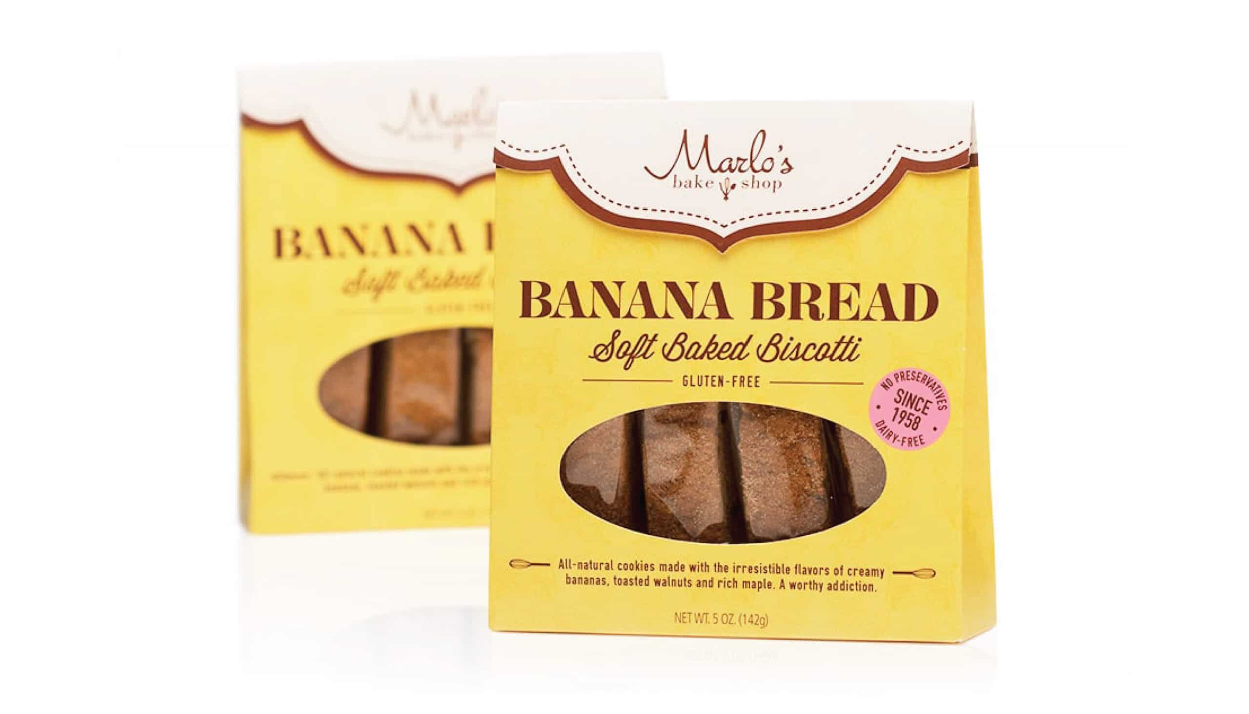
What’s an example of the best custom packaging? This banana bread biscotti is a unique and giftable product, so we designed a custom-shaped box to communicate just that! A large window reveals the delicious-looking product. Big type grabs attention and informs the customer what the product is. We included descriptive flavor copy on the front to entice as well as key selling points to keep the front simple and clear. Marlo’s Bake Shop
Vegan Cheese Packaging Design
Standing out from the competition—Best Cheese Packaging Design
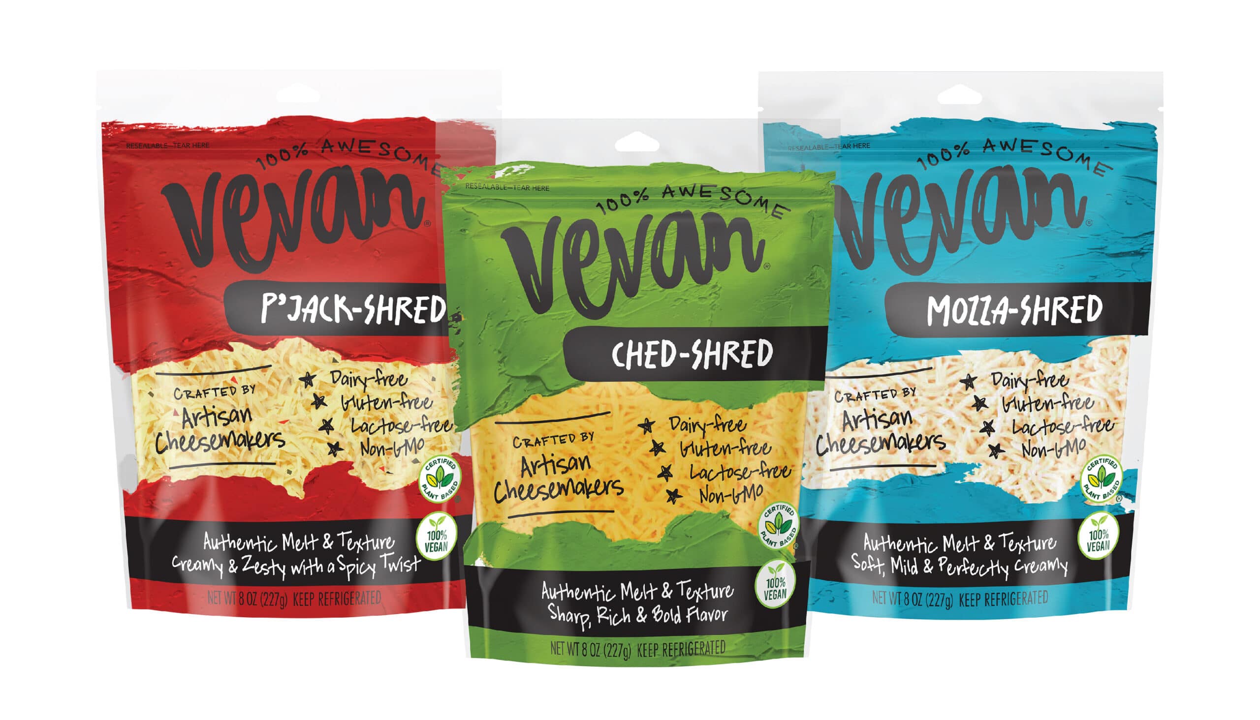
What is the best experimental food packaging design? Look no further than Vevan, a revolutionary plant-based cheese that tastes and melts just like dairy cheese. We pushed the boundaries of packaging design here to be completely unexpected for the category, with bold color, paint strokes and a handwritten approach—to help the packaging unapologetically stand out from the clean, minimalist look of the competition. While standing out is always a great tactic, we are strategic about the product packaging design methods we use to differentiate and help keep the brand authentic. The handwritten fonts and custom hand-lettered logo echo the idea that this cheese is crafted by real cheesemakers who applied their cheesemaking expertise to create the best vegan cheese. The “100% awesome” tagline is fun yet reinforces that this product really is different and better. We included key selling points on the front to instantly convey all the ways this product really is awesome. Vevan Foods
Naan Pizza Frozen Box Packaging Design
Breaking into a crowded category with a new product—Best Pizza Packaging Design
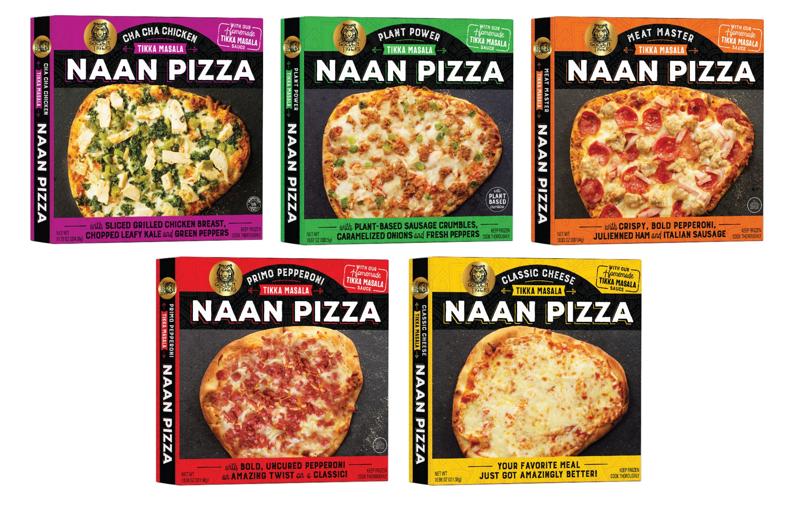
Frozen pizza is a crowded category with room for innovation. Naan pizza features traditional Indian naan bread with a tikka masala sauce and traditional pizza toppings. We made the product title bold to pop out from behind the freezer case glass, with the variety name set in smaller type. We also used large high-quality product photos to convey the deliciousness at a glance. Appetizing, clear descriptions entice customers to try this familiar—yet not familiar—product. Also, variety names, like Cha Cha Chicken and Meat Master, impart a fun element and further distinguish this product line as different. Golden Tiger
Chocolate Truffle Packaging Design
Communicating unexpected product features—Best Chocolate Packaging Design
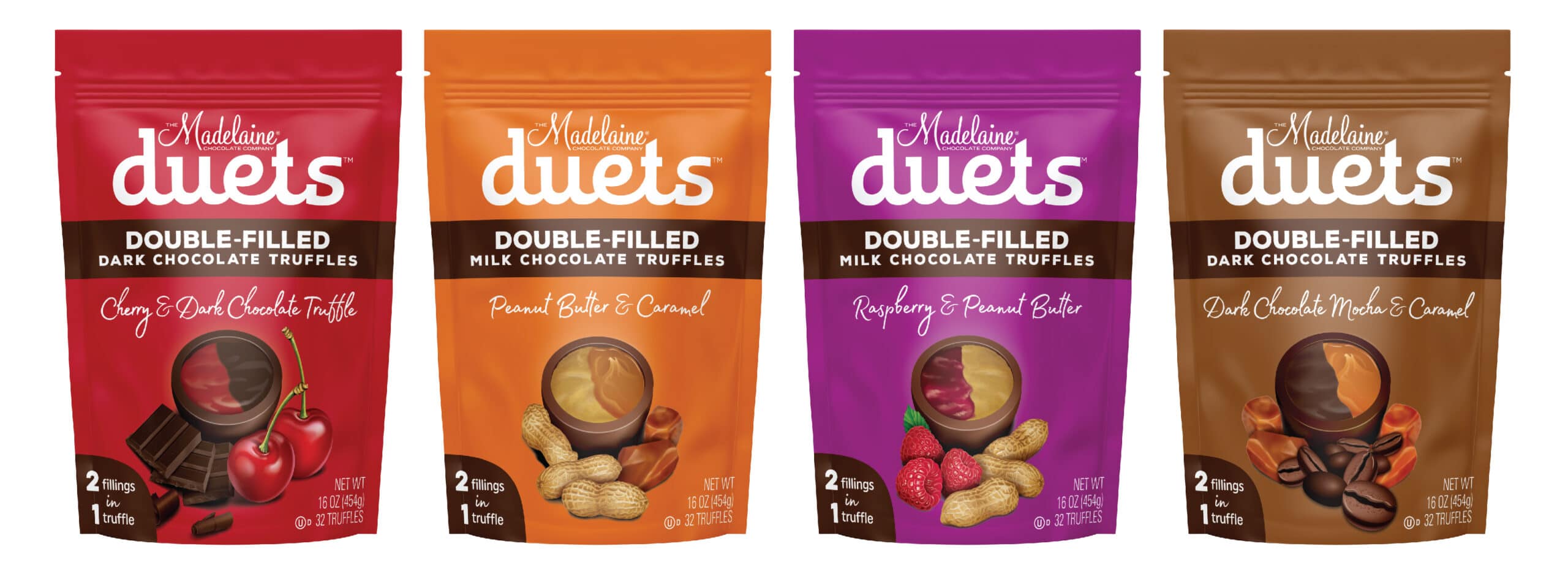
Most chocolate truffles don’t have two flavors in one. As their name suggests, Duets do.
We featured a large, single-product illustration to clearly show the dual fillings and the flavor ingredients. A callout on the front also communicates the 2-in-1 product feature. (You can never overemphasize key selling points!) Package color differs with each flavor. To keep the front simple, the brand’s heritage is highlighted on the back. Madelaine Chocolate Co.
Curcumin Wellness Supplement Packaging Design
Effectively communicating a lot of information—Best Supplement Packaging Design
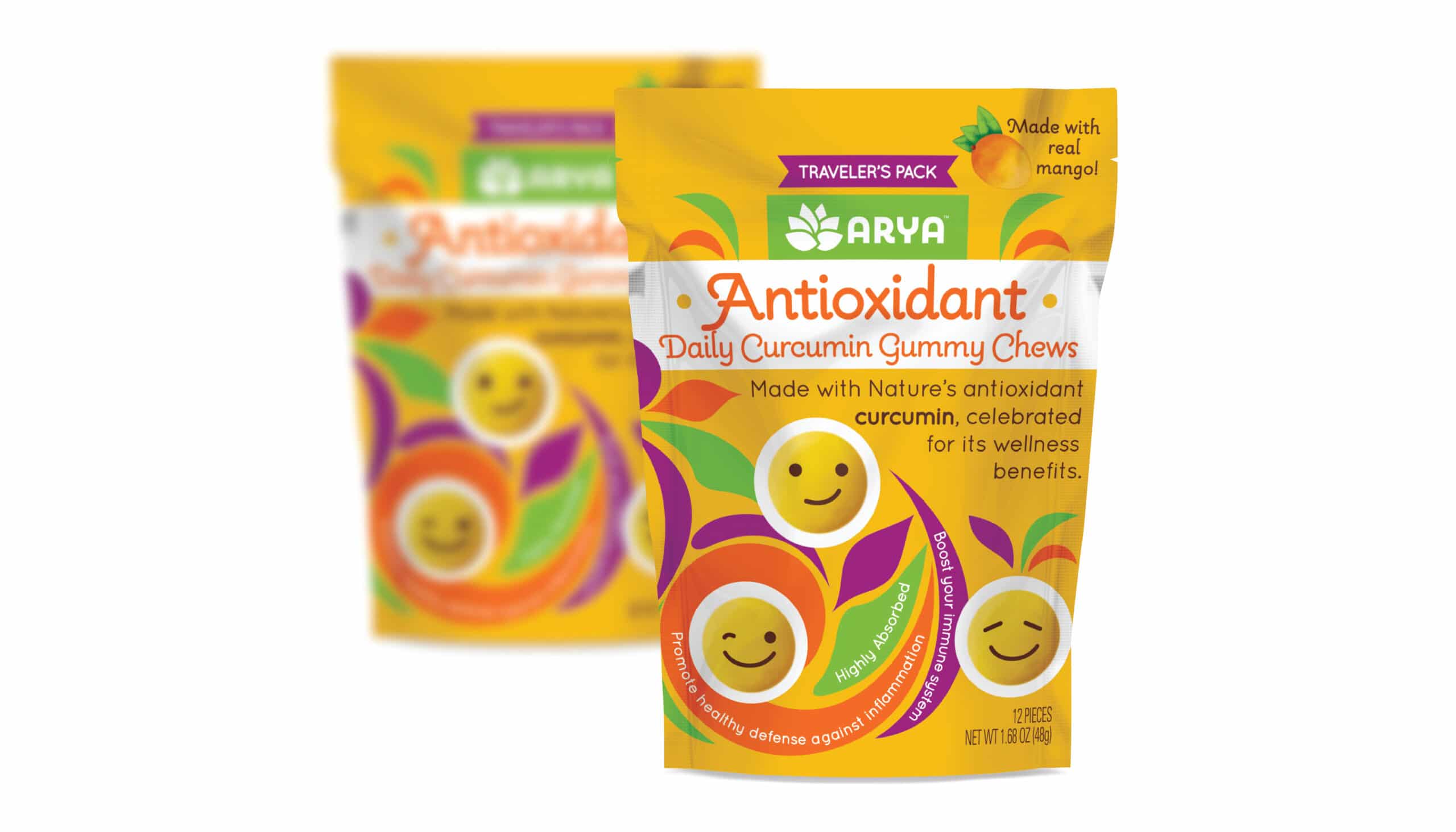
These curcumin gummy chews are a family-friendly product with an approachable design. The chews are individually wrapped and look like emojis. Our primary challenge was how to communicate a lot of information without overwhelming the casual shopper. We created an effective information hierarchy to communicate the many beneficial aspects of curcumin. The text stating what the product is and what the benefits are receive the greatest visual emphasis. Conveying this information succinctly is more effective than overloading a reader with a big block of information. The large product description tells the customer what the product is while a secondary line conveys the benefits of curcumin. Other selling points are integrated into the swirls of the illustration, and the back further informs on the benefits. Arya Antioxidant Curcumin Gummy Chews
Hot Cocoa Tin Packaging Design
Differentiating with a small package—Best Tin Packaging Design
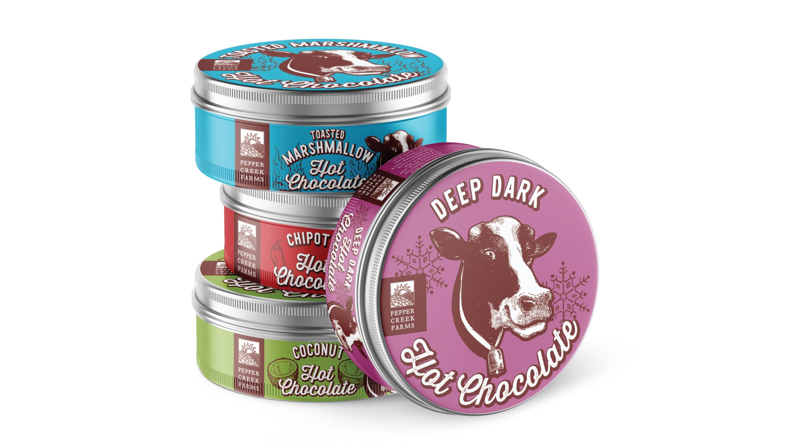
How can you make a small package stand out? With a big illustration of a happy cow that becomes the “spokescow” for the brand! Each flavor has a different color. We combined vintage-style illustrations with a fun, fresh design for an interesting balance. Bold color further helps the packaging stand out, while clearly differentiating between the flavors. Simple, effective, and fun packaging designs—we love it! Pepper Creek Farms
Salad Dressing Bottle Packaging Design
Standing out in a crowded category—Best Salad Dressing Packaging Design
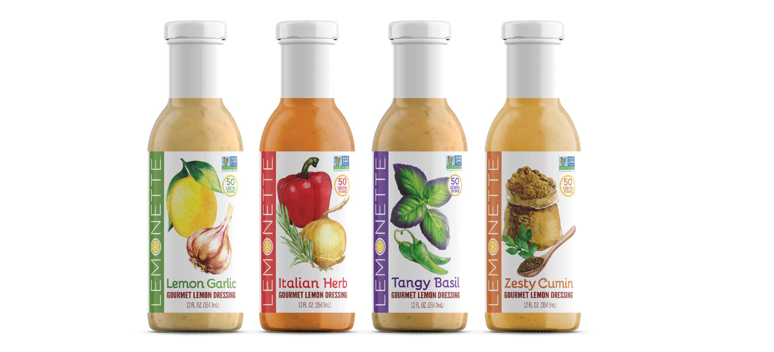
This is a better-for-you dressing made with clean ingredients, and distinguished by using a lemon base as opposed to a vinegar base. We used a white background on the label to convey the purity of the ingredients. If not done effectively, a white label can look plain and blend in. But here the white background makes the bold type and colorful illustrations pop. We set the long brand name vertically so it could be large on the front label while also offering another point of differentiation. Each flavor has a different package accent color to clearly differentiate, while a prominent calorie callout on the front of the package conveys another key selling point. Lemonette Dressings
Pasta Sauce Jar Packaging Design
Standing out in a crowded category—Best Pasta Sauce Packaging Design
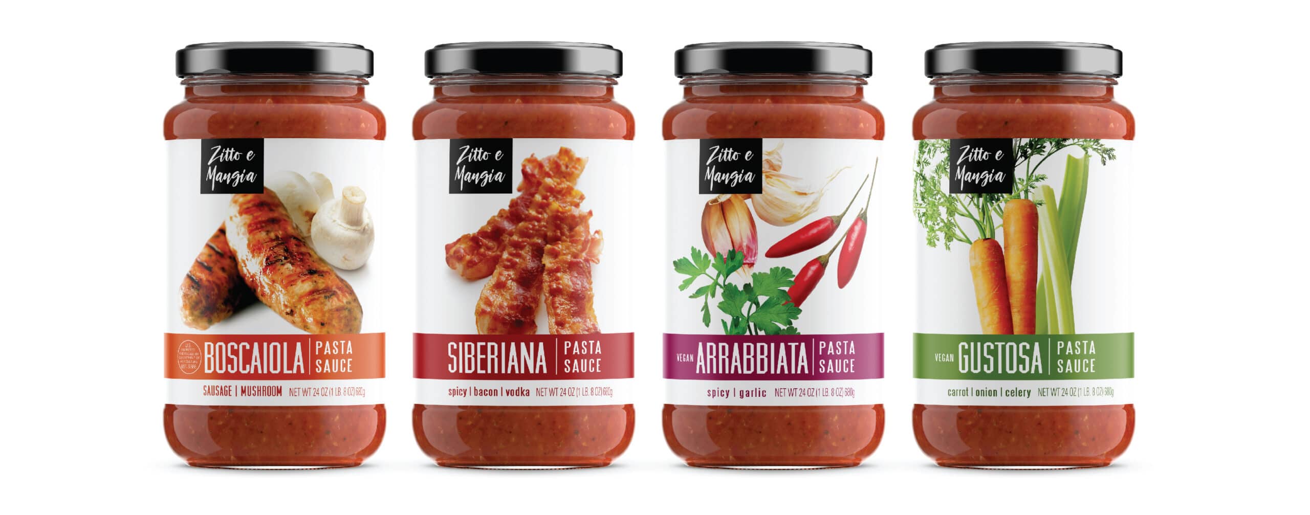
The pasta sauce category can be predictable, with many brands featuring traditional Italian imagery and design on a red-hued label. Enter Zitto e Mangia (which means “shut up and eat” in Italian—what a great brand name!). We designed this brand so it wouldn’t look like the competition. Likewise, the bold photography doesn’t feature the expected tomato, the primary ingredient, but rather those ingredients that make each variety unique. Think beyond the humble tomato. Zitto e Mangia
Condiment Jar Packaging Design
Craft Pepper Jelly, Jam, Honey Butter, Flavored Butters, Chocolate Sauce
Using a brand’s youth to its advantage—Best Jam/Jelly Packaging Design
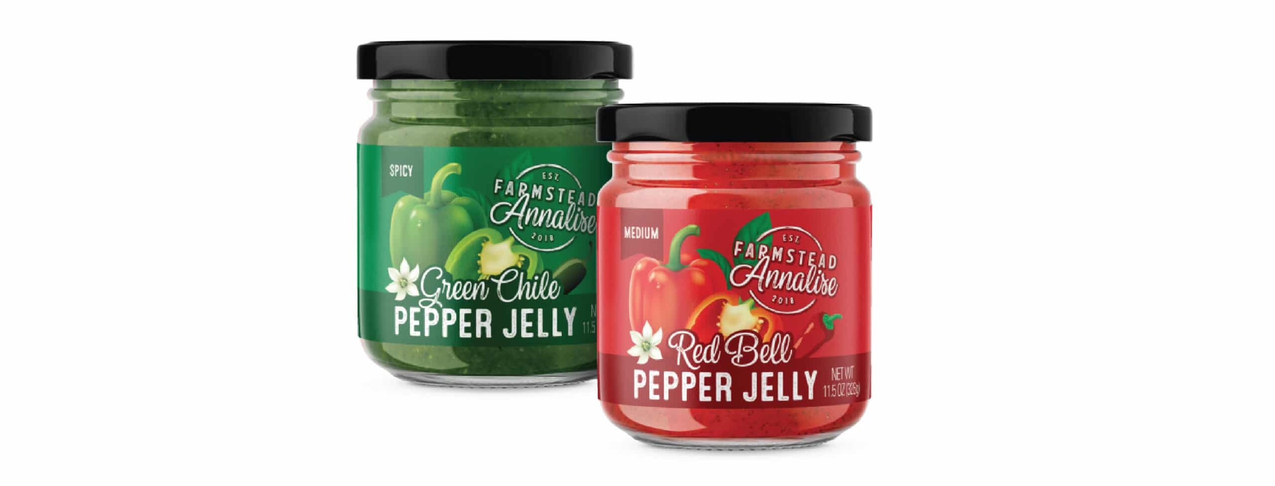
This new brand launched with a fresh take on traditional food condiments. Instead of making it seem like they’ve been around for awhile, they used their newness as an advantage—the logo emphasizes that they were established in 2018. They celebrate that they are a young company with new ways of doing things by creating better-for-you products with fresh ingredients and unique flavor combinations like whiskey with peach jam (and fun names like Drunk’n Peach!). We utilized large type to clearly convey what the product is, and imagery that is large, enticing and stylish. We love the simple modern elegance of this colorful packaging design! Farmstead Annalise
Raw Bread & Cracker Alternative Pouch Packaging Design
Taking raw food mainstream—Best Raw Food Packaging Design
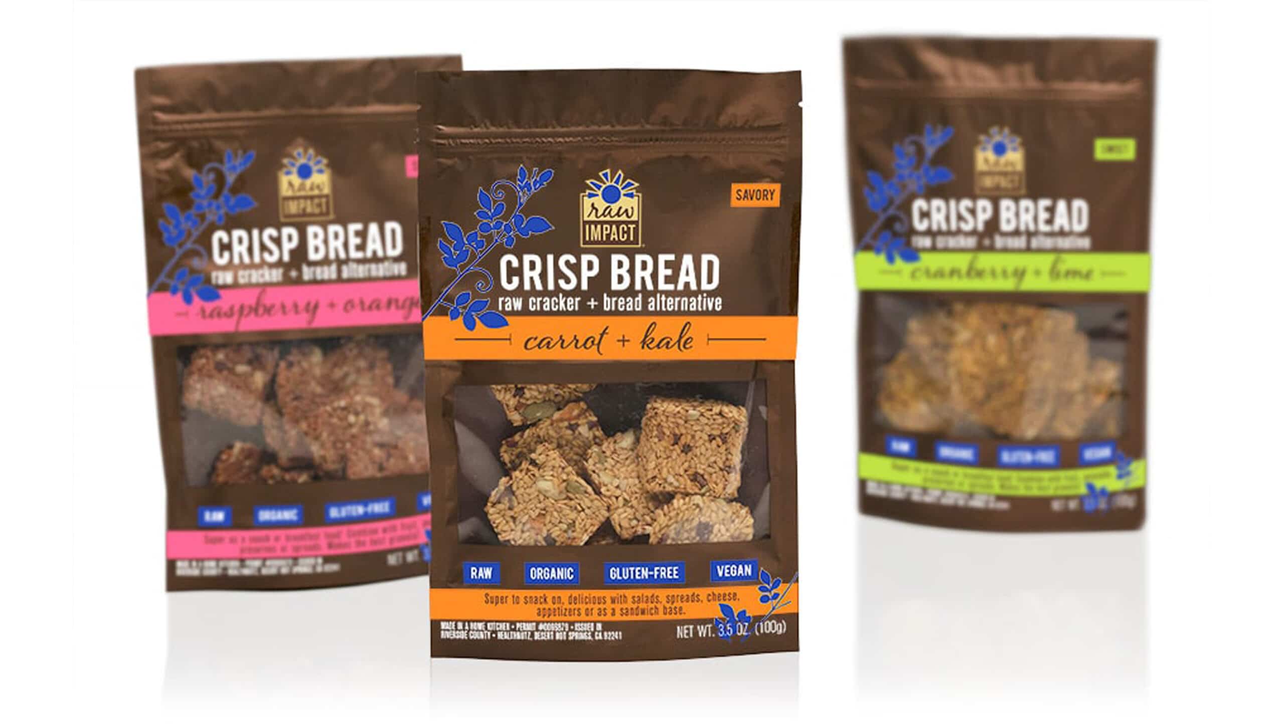
This product makes raw food accessible for the average grocery store shopper. These raw cracker and bread alternatives are created without any baking. We included a clear window to showcase how delicious looking the actual product is, to entice customers. Bright color accents on the package highlight the different varieties. We communicated the product’s many uses on the front to inspire customers that are new to this type of product. Raw Impact
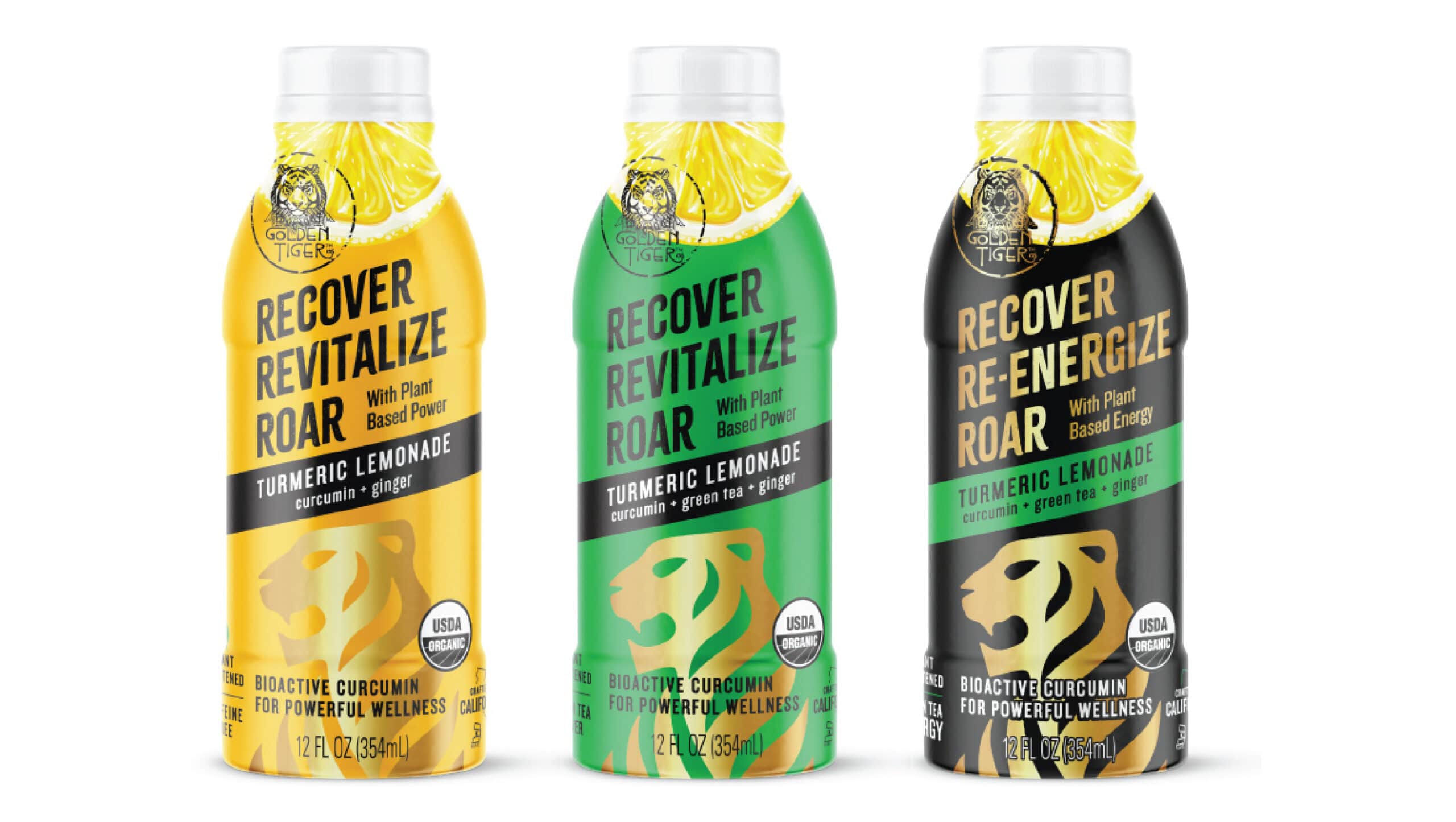
Turmeric-infused Curcumin Lemonade & Natural Energy Drink Bottle Beverage Packaging Design
Positioning a new wellness beverage—Best Drink Bottle Packaging Design
Golden Tiger is on a mission—to share the healing properties of turmeric and curcumin in an Ayurvedic “east-meets-west” approach. This curcumin-infused drink straddles the sports drink, energy drink and wellness drink beverage categories. The large lion image gives a nod to the Indian origins of curcumin—the healing ingredient in the beverage—and the brand namesake. This wellness beverage makes it easy and approachable to eat and drink for wellness and healing. Golden Tiger
In Conclusion
We hope you enjoy these 20 food packaging trends you need to be aware of in 2020. These are some of our best food package design strategies that you can apply to packaging challenges you may face in your own food brand. If you’re wondering, Where can I find a good food package designer? Get started here. You can also check out our creative packaging design Pinterest boards, and we have more inspiring packaging designs and resources on our website at www.jenndavid.com.


