We received some recent press on our work that referenced the giftability of the design—how you will want to keep the packaging even after the product is gone because it’s so beautiful. We were honored, of course! Making the package beautiful like a gift has always been one of the focuses of our work. Who can resist a beautiful gift?
Gourmet food products are premium, specialty products, often given as gifts. Even when buying for yourself, it’s like a gift to yourself—a treat, a perk or something special. The more beautiful and stunning the package, the more consumers will covet it. Have you ever seen something you just had to have and couldn’t stop yourself from buying it? You can’t take your eyes off of it and it calls to you from the shelf with magnetic appeal. It’s like that.
But beauty alone will not get your package where you want it to go. You also need proper messaging, usability and functionality of the package. Many of our other articles reference the functionality of packaging design (see our Brand Strategy articles and our Keys to Effective Packaging Design Series), however here I’m going to focus on how to make the package beautiful, and truly a work of art.
Use color wisely.
Color is one of the strongest aspects in design. (Related: Colors That Influence Food Sales.) Color evokes emotions and attracts consumer attention. Selectively incorporating bright, bold or vibrant colors not only grabs attention but can be quite arresting when you see so many strong colors together in a line of products.
It’s a fine line however because the tone and hue of the colors, and the manner in which they are used together, can easily border on being too loud and garish. So you want to make sure you’re using sophisticated colors appropriate for the product, and use them tastefully (no pun intended!). A general rule is to use one strong color per product in the line, but of course there can be exceptions to this rule.
It can be beneficial in certain cases to “brand-block” a line of products (visually block off a set of items on the retail shelf with a near-identical look) by having them all be uniform in color. However this type of design strategy can make it difficult for the consumer to distinguish between the different products in the line, leading to frustrating product confusion. When a design using color as a differential is strong and iconic, the design itself becomes the brand block, and the set of products is made even more arresting with strong variations in color, denoting the different flavors within the line.
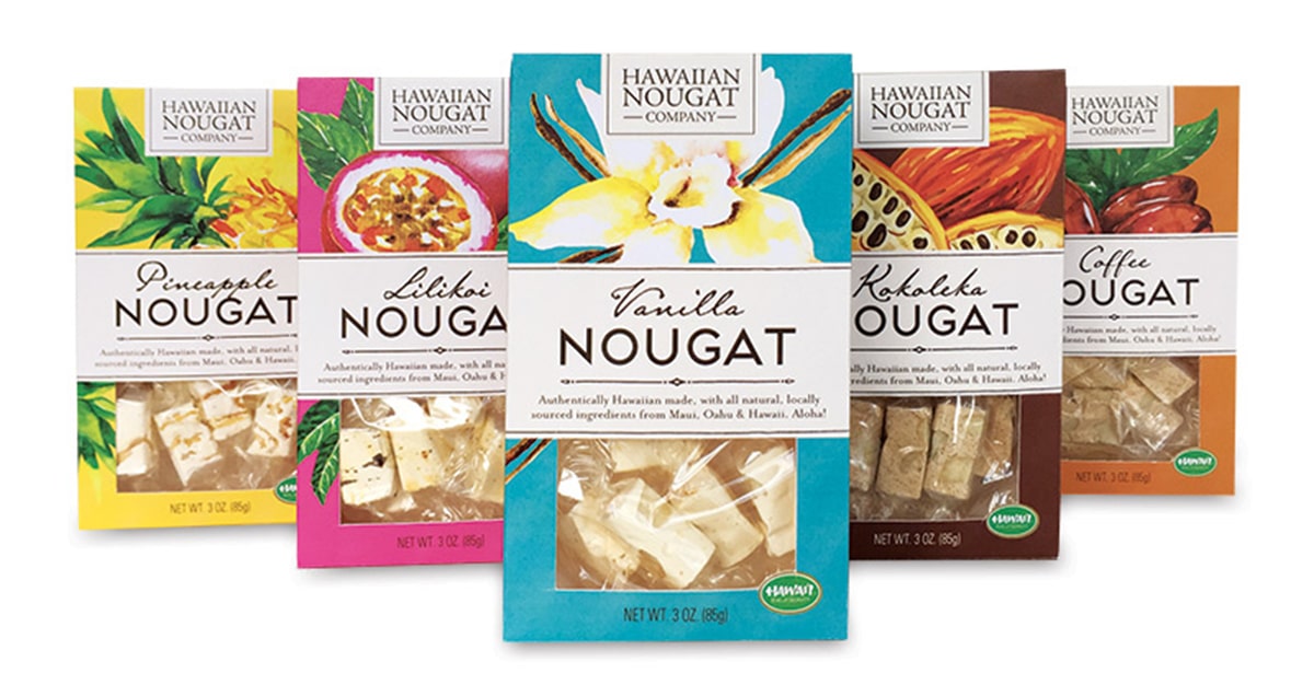
In the Hawaiian Nougat Co. design at the top of this article, we used bright, bold colors to convey the feel of the islands for this Hawaiian-made authentic nougat geared toward tourists.
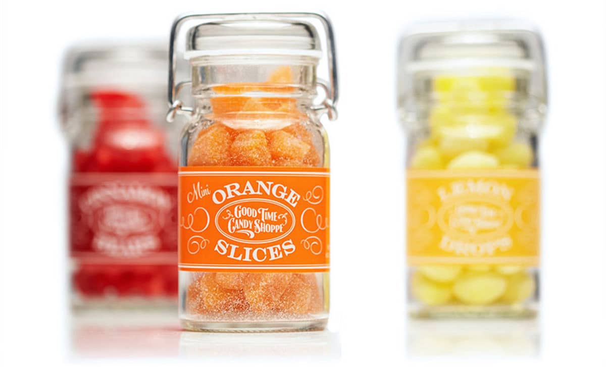
We matched the color of the label to the color of the product to make a color powerhouse in this clean, sophisticated design for Good Time Candy Shoppe:
Incorporate appropriate imagery.
Illustration or photography helps further set a mood in addition to color. Depending on the style of the imagery, that mood could be traditional, romantic, classic, trustworthy, sophisticated, modern, jovial or other, and it can be any combination of moods as well. The imagery can also reinforce the flavor of the product—such as showing a vanilla bean for vanilla flavor—which makes the package more appetizing and appealing. Imagery can be captivating, especially when combined the right way with strong use of color.
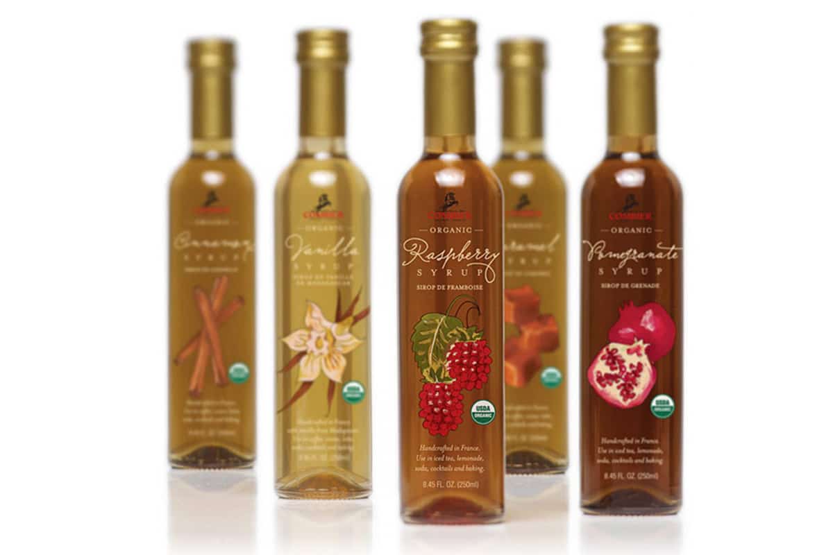
In this set of organic syrups for Combier, we put the focus on a signature, central, custom watercolor image denoting the flavor.
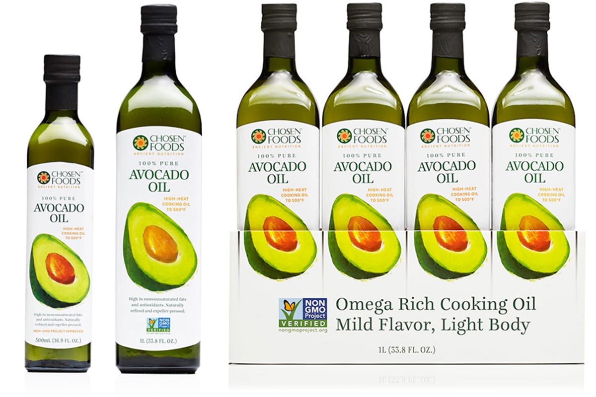
A bold yet soft, custom illustration of an avocado is the focus of this avocado oil we designed for Chosen Foods. We had fun designing the display box to go with it—have you seen it in Costco? It makes an arresting visual brand block on the pallet:
Show the product.
It’s almost always best to show the product itself through the package whenever possible, especially if your product looks really good. (Related: To Show or Not to Show a Product Photo on a Package.) If you can’t show the actual product for whatever reason, then show a high-quality, professional photo of the actual product. Consumers want to see what they will be getting before they buy it. Showing the product—either itself or a photo—also makes the package as a whole more appealing and appetizing.
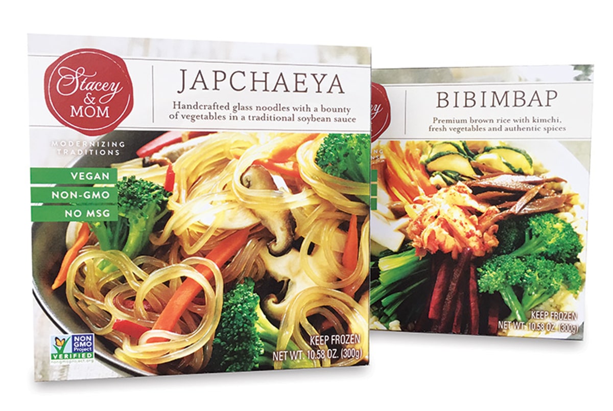
In these debut products for Stacey & MOM, it wasn’t possible to show the actual food through the box for these frozen entrees. Instead we put the focus on the elegant photography that covers the entire package. The photographs include stylish props and wrap the entire box to set a tone of sophistication and elegance:
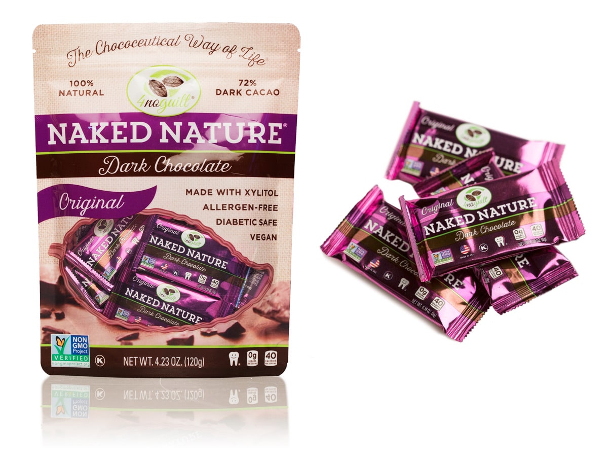
Our pouch design for this Naked Nature line of chocolates sweetened with xylitol by 4noguilt has a window through to the inner product. Even though you can’t see the actual product because it’s wrapped, it’s still worth showing what’s inside the pouch—not only so the consumer knows what to expect before buying it, but also because the little foil wrap is attractive and highly giftable:
Use creative typography sparingly.
The fonts used on a package also affect the mood. Careful attention to detail is required to hone in on just the right mood since there can be so many nuances with different font styles. Combining different fonts can create visual excitement and texture, but you want to make sure they go well together and don’t clash. Use decorative fonts like garnish—just a touch for flair.
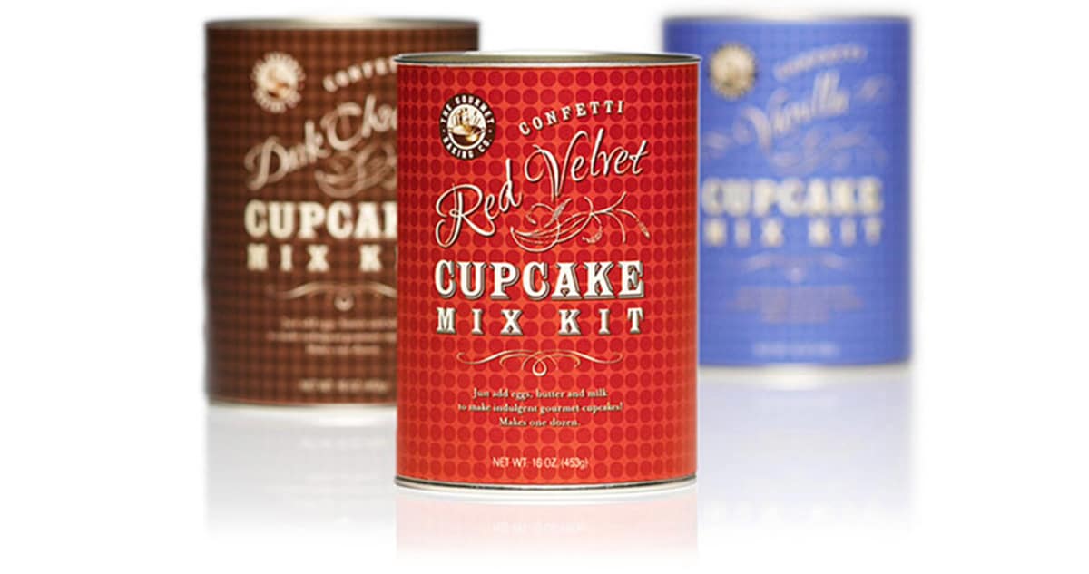
In this Gourmet Baking Co. design, we added a flourish with a fun, jubilant script font to denote the flavor:
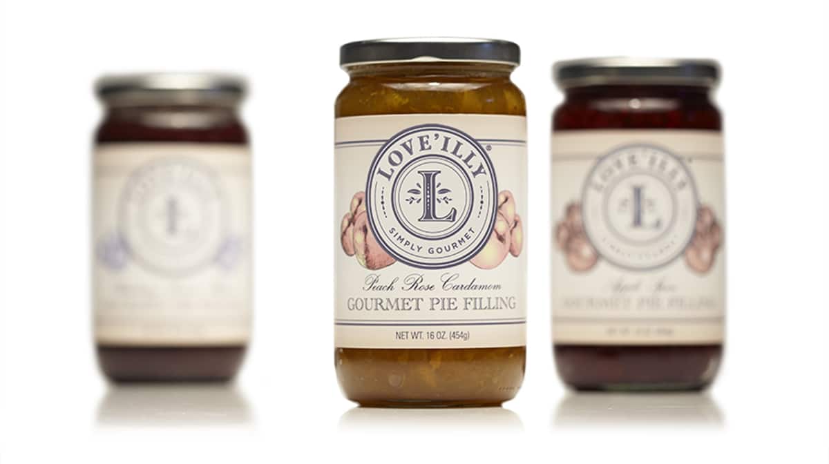
Here is a rare example of when we do use an ultra-formal script font, used in this package to convey timeless sophistication and evoke a traditional, classic baking mood, in this pie filling for Love’illy:
Consider the overall package a gift.
Consider making the package as a whole reminiscent of a gift in itself. Boxes in particular lend themselves to this notion, because gifts often come in the shape of a box. However it need not be a box to be like a gift. Below are examples of how we’ve “gifted” not only a box, but also a tin can and a snack pouch.
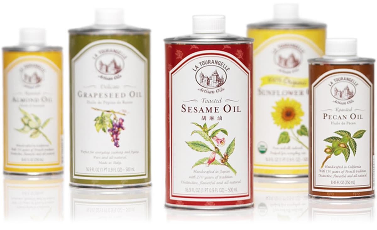
Our packaging design for La Tourangelle Artisan Oils, which has been going strong for over a dozen years, has become an iconic design on the retail shelf. The tin can features an allover pattern, which is subtly reminiscent of gift wrap, made with each oil’s signature botanical image seen on the front panel:
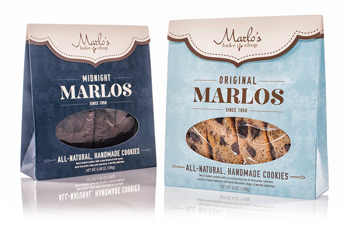
This box and packaging design we did for Marlo’s Bakeshop is a chic purse-like shape that is highly giftable. Here again, a very subtle pattern is used like gift wrap around the package:
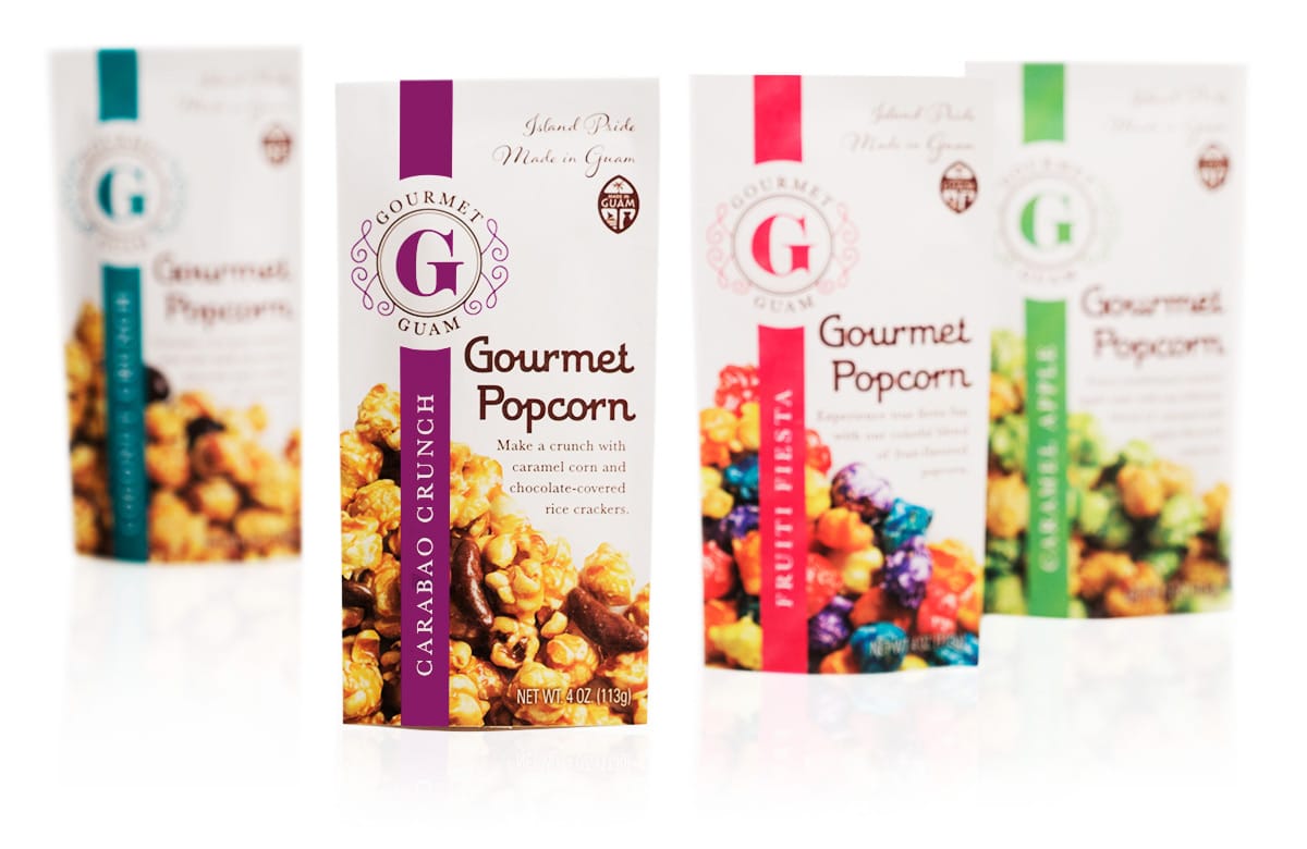
Our fresh design for Gourmet Guam, which makes gourmet popcorn geared toward tourists in Guam, features a vertical color band that is similar to a ribbon around the package, sealed with the logo:
Remember that beauty alone does not make a successful package. A package without proper strategy to close the sale falls short on performance regardless of its looks.
For more details on the strategies we employ in our packaging design process, get our new free guide, The Strategic Side of Packaging Design, coming later this month. Sign up for our email newsletter at the top of this page to be notified when it is available.
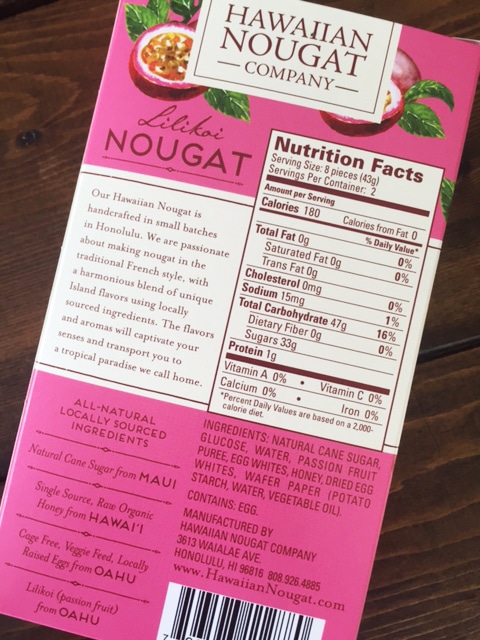
Update 11/23/15: Here is the back of one of the Hawaiian Nougat Co. boxes as requested in the comments.


Hi Jenn,
Your packaging is beautiful!
How do you price your services? By the hour, the job, the package? I am just starting to work on a cookie company (starting with refrigerated dough balls, and will expand from there). I’d appreciate you sending me some info.
Thanks so much,
Marjorie
Hi Marjorie,
I’ll email you with more info.
Jenn
So lovely and elegant. Love your work.
Jenn! it is so easy to work with you! You vast knowledge of the food industry, FDA regulations and great design skills keep you on a class of your own!
Looking forward to new website design, POS and many more package, foil designs for us and our private label customers.
Regards
Guy
Thank you, Guy!
Hi Jenn,
The Hawaiian Nougat Company packaging is absolutely amazing. I would definitely keep that packaging long after I ate up the yummy nougat!
Can we see the back of the Nougat packaging please? After reading your great series on packaging, I would love to read what “romance” copy you put on the back.
Also, I was wondering if you could recommend some copywriting books please. So far I’ve read Joseph Sugarman’s book – The Adweek copywriting handbook. I’ve been looking for a copywriting book specific for packaging, but haven’t found any good ones yet. And one more tiny question… are there any books that specifically cover words that are effective to use? I’ve seen books like Words that Work or Words that Sell, but I’m not sure which ones are good to get. Any recommendations would be wonderful!
Love your posts.
Thanks!
Meegan
Hi Meegan,
Glad you enjoy our posts!
We’ve updated the post to include a shot of the back of the nougat package at the end of the article.
We don’t have any copywriting books to recommend since we rely on our own experience and expertise. There really isn’t a one-size-fits-all solution to which words work better than others. Some of the wording is dictated by the FDA’s regulations, and in each case we focus on what works best for the specific product and its specific audience.
For example as you can see on the back of the nougat package, we called out where the individual ingredients come from since it is sourced from local ingredients. The audience is mainly tourists and locals looking for an authentic gift to give to non-islanders, so this is a big selling point.
Your questions may inspire a future article on this topic, so stay tuned!
Best,
Jenn
Thanks so much Jenn for your detailed reply and including the back of your packaging. It did not disappoint! Really like how you used the space.
I’m looking forward to your future posts. Would definitely enjoy some more on copywriting. 🙂
Thanks again for taking the time to answer my question.
Best,
Meegan
Hi,
I would love more information regarding pricing. I have a tea company and I really love your work!
Hi Marie,
Just sent you some information via email!