Snacks & Cookies
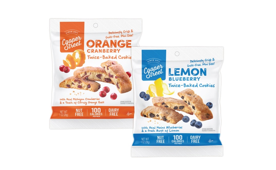
Twice-Baked Cookies
Twice-Baked Cookies
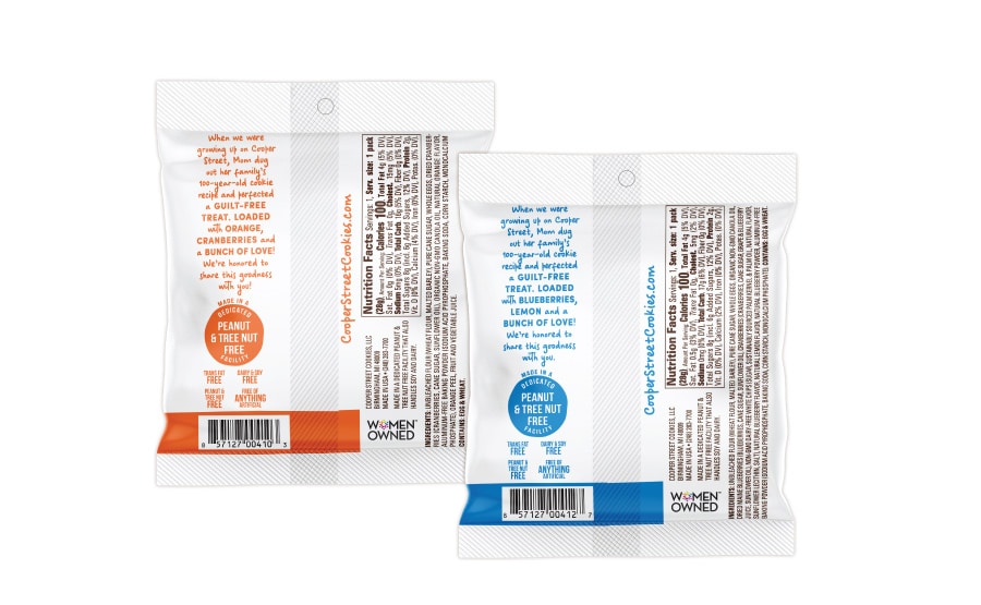
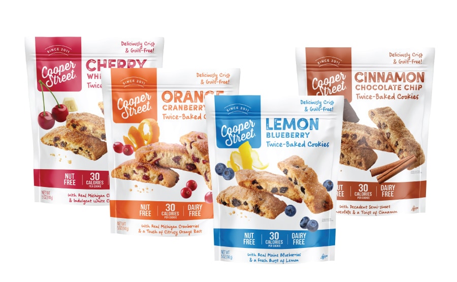
Jenn David Design revitalized this brand and cookie line with a fresh look that was an evolution of their old look so brand recognition was retained. This clean and minimalist packaging design appeals with big images, fun colors and clear information on key selling points. We also designed Cooper Street’s other cookie line as well as their website.

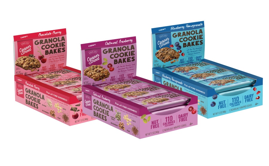
Granola Cookie Bar Bakes
Granola Cookie Bar Bakes
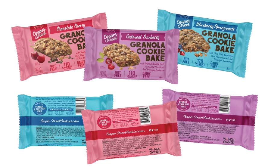
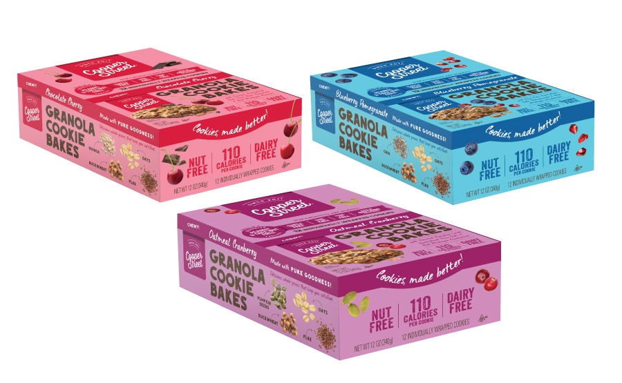
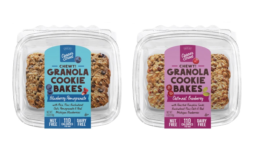
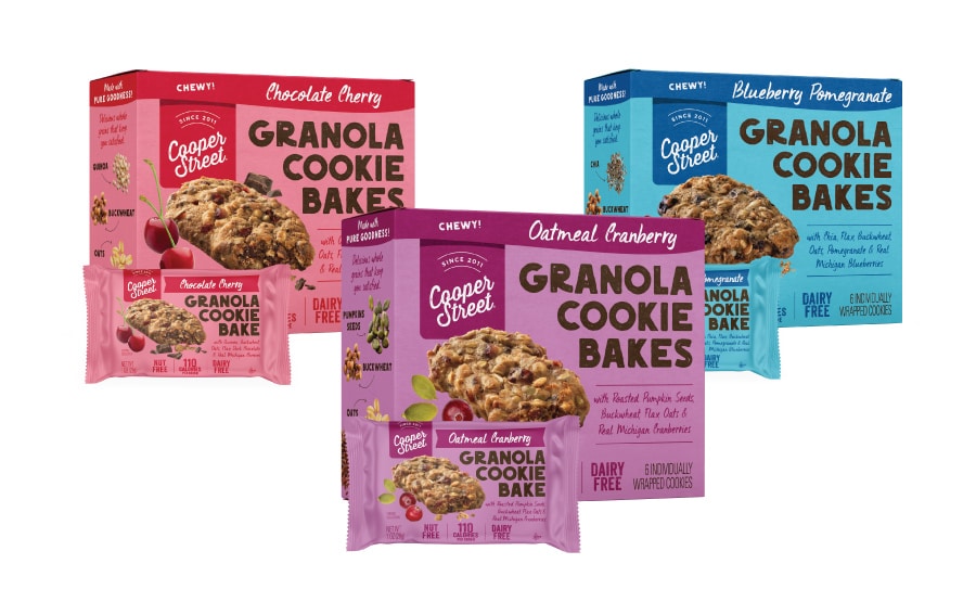
This was a brand and packaging redesign where we retained brand equity by making the brand revamp an evolution of the previous version. The previous packaging for these granola bars was underperforming and had too much info all over the place so that the most important selling points were obscured. We brought in big color, bold type, big images, and organized the selling points to convey only the most important ones on the front and secondary ones on the back.
We rolled out the new cookie packaging design to boxes, POP display caddies, individual wraps and clamshell packaging. Jenn David Design also designed Cooper Street’s other cookie line as well as their website.
Caramel Corn
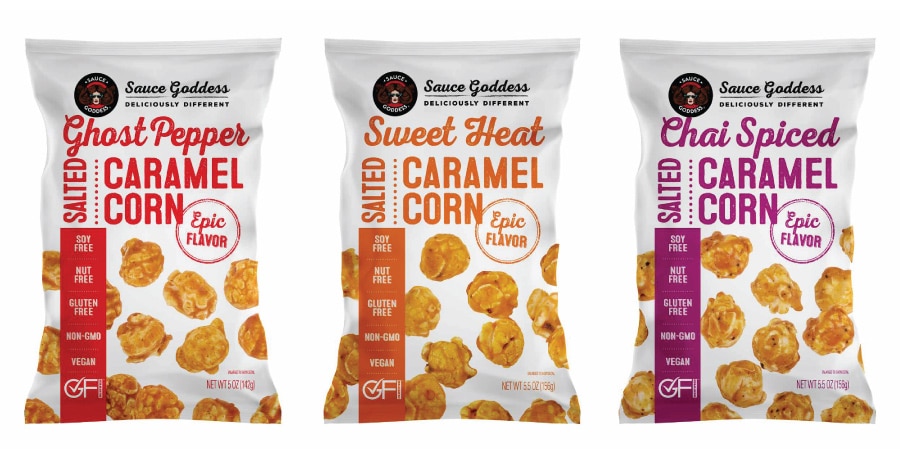
Caramel Corn
This caramel corn combines the amazing spice blends that Sauce Goddess creates with caramel corn. A fresh take on a traditional treat! Our design is clean and modern, with bold color to clearly differentiate, and an element of fun and whimsy with popcorn playfully placed throughout the pouch.
Burdock and Lotus Root Chips

Burdock and Lotus Root Chips
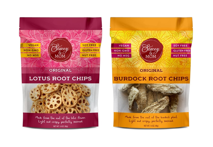
We designed these colorful pouches for Stacey & Co. to feature a subtle asian-inspired background pattern and bold colors to stand out. The window shows the product though and key selling points prominently flank their iconic red logo, which we also designed.

Longevity Bars
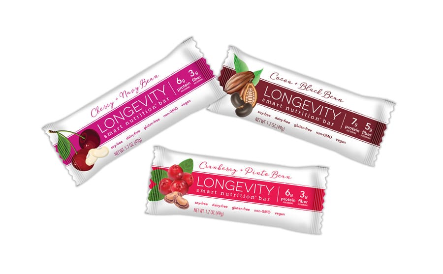
Longevity Bars
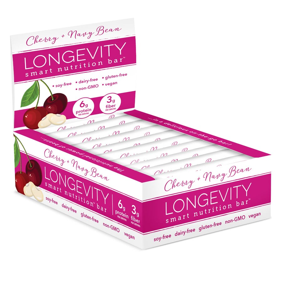
Jenn David Design developed the packaging design and branding for this line of healthy snack bars based on beans, which have been shown in studies to increase longevity of living, hence the product name Longevity. We also designed the caddy display box to go with it. The clean and minimalist yet colorful design lets the important information be the focus along with an eye-catching image of the fruit and bean type featured in each bar.
Wafer Roll Cookies

Wafer Roll Cookies
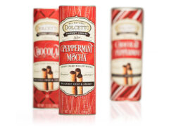
We developed this holiday canister packaging design for the Dolcetto’s line of packaging to boost holiday sales as a limited-time seasonal design. A signature holiday red color pairs with cream and brown accent tones for warmth and a chocolatey vibe, while the background patterns add fun and excitement while differentiating the flavors.
Cello Whisps
Cello Whisps
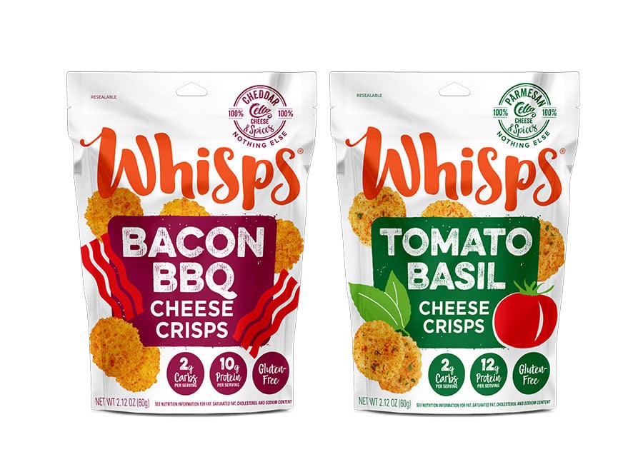
We’ve been working with Schuman Cheese since 2014 when they came to us to develop the packaging design for their new line of pure cheese snack crackers. Already a huge presence in hard cheese manufacturing in the US, this was their first foray into the snack market. You can now find Cello Whisps in major stores across the US and Canada. We continue to work with their innovation department as they roll out frequent new products.
Raw Crackers
Raw Crackers
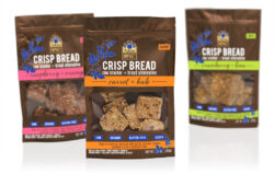
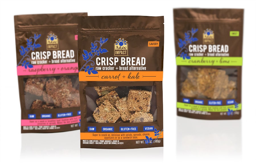
Raw Impact came to us to develop their branding and packaging for their new line of raw crackers/crisp bread. The resealable pouch with window shows off the beautiful product while being protective and convenient. We used metallic gold for a little pop, and bright, bold colors to easily signify the flavor differences. The packaging has been a success in helping them make a powerful entrance into the raw snack sector.

Soft-Baked Biscotti
Soft-Baked Biscotti
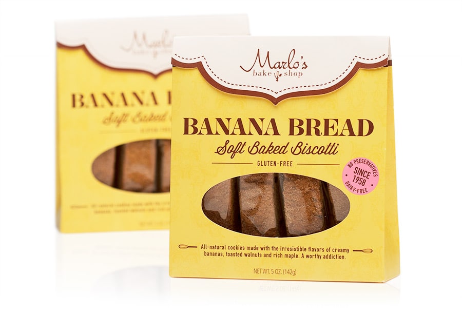
After designing Marlo’s original packaging in the custom box shape we developed, we helped them roll out their next flavor in this boxed line. This line has been a huge success and they’ve only been growing since.
Snack Croutons

Snack Croutons
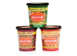
Snack’ons broke into the snack market with an unusual take on croutons—exciting flavors of croutons you can snack on. Innovative packaging was essential to grab attention, yet it needed to be easy for the consumer to use and reuse. We led them to the reusable plastic cup solution, and developed the identity and design to go with it.
Gourmet Popcorn
Gourmet Popcorn
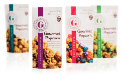
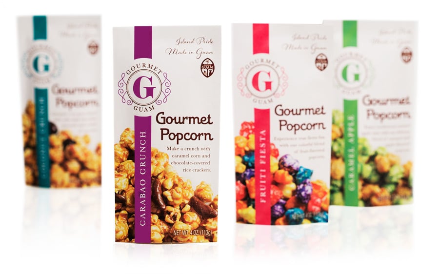
Gourmet Guam sells premium popcorn made locally in Guam primarily as a souvenir for travelers, in high-end duty-free stores. Their previous packaging was a stock pouch with a window which looked generic, and the window wasn’t protecting the product well. We helped them upgrade to a new foil pouch with a sleeker profile and custom design, showcasing their handcrafted popcorn in an exciting and appetizing way. We also developed their new logo mark.
Marlo’s Bakeshop Cookies
Marlo’s Bakeshop Cookies
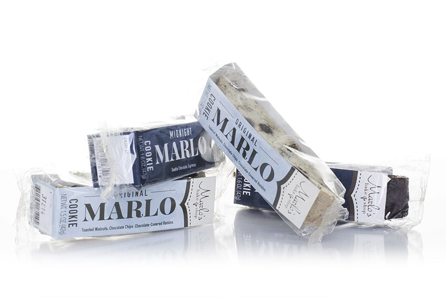
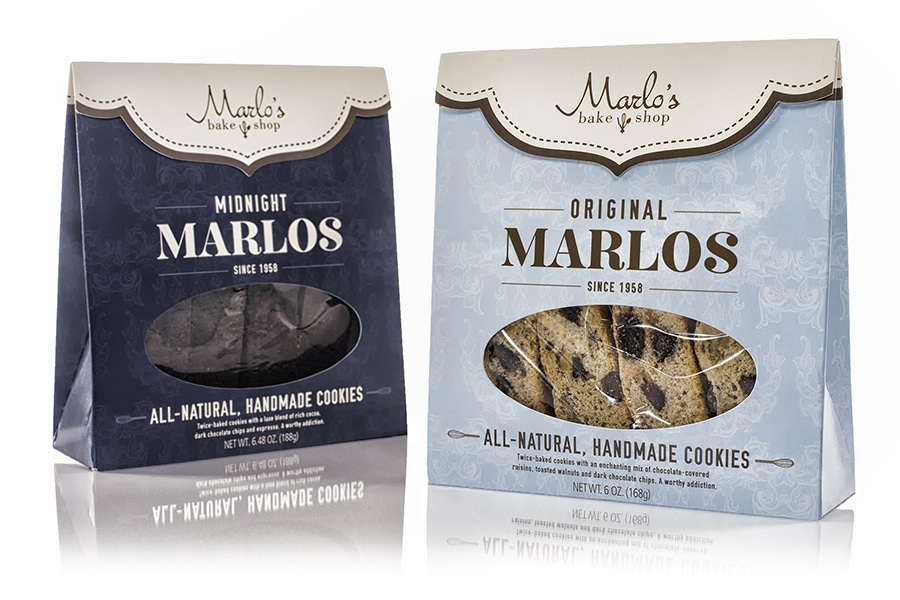
What’s the best part about designing cookie packaging? Sampling the product! We developed this design for this high-end cookie line to represent the integrity of the product and the brand’s story. The gabled box is chic and purse-like, and the shaped flap also serves as the box opening. It was an all-around fun—and delicious!—project.
Snack Mixes
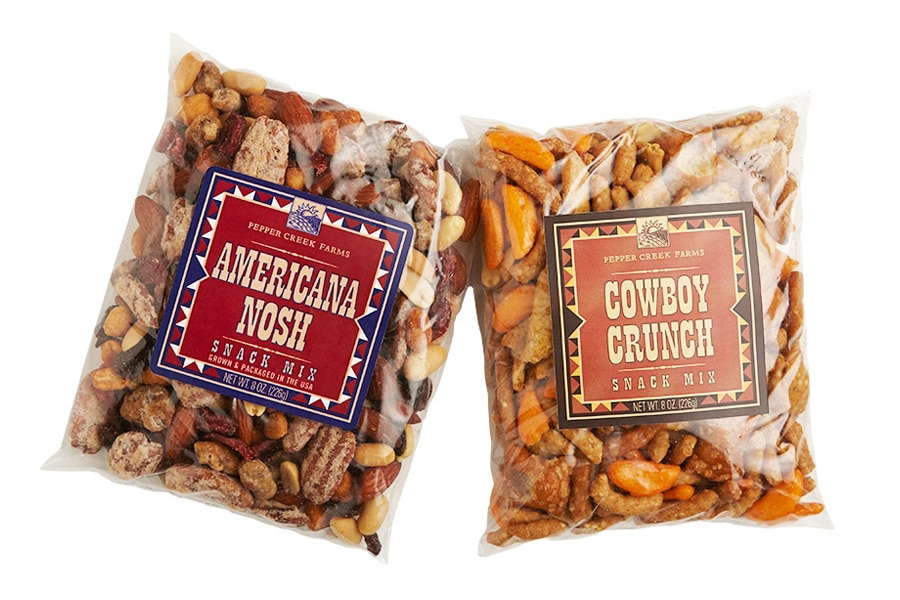
Snack Mixes
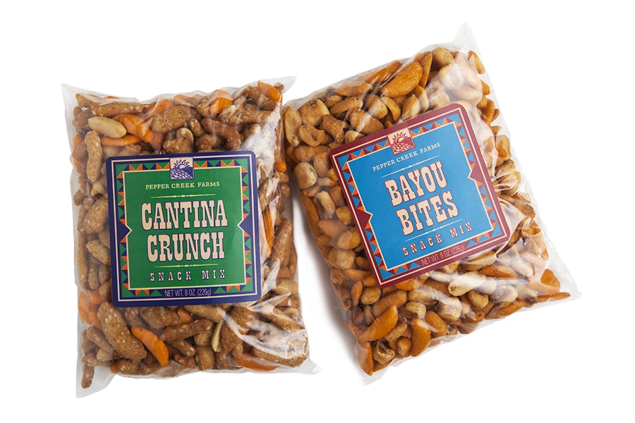
An Americana theme with muted colors and bold typography suited this line of snack mixes.
Beans

Beans
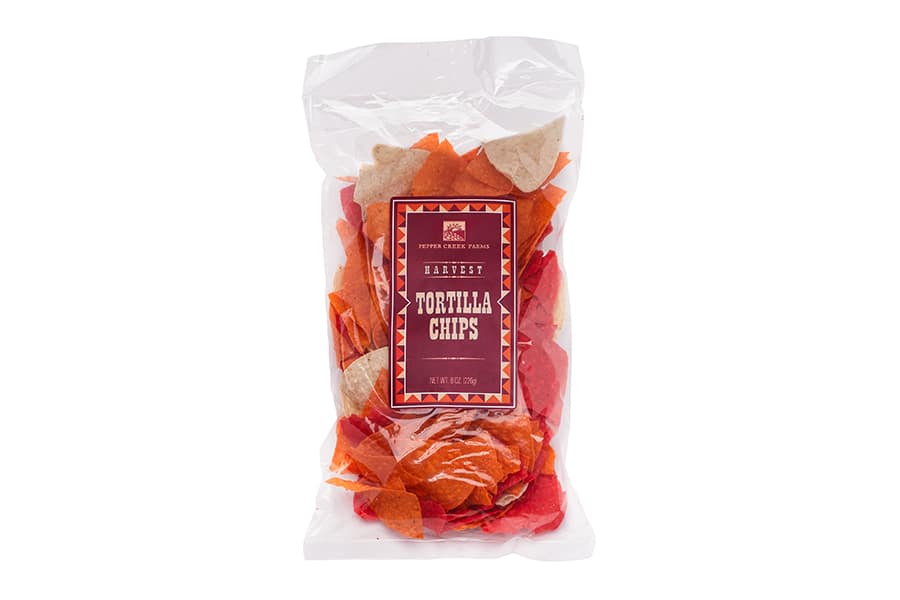
Design for new line of dry beans. Goal was to bring excitement to the otherwise simple product in a way that still fits within the Pepper Creek Farms family.
Victory Garden Pickle Kit
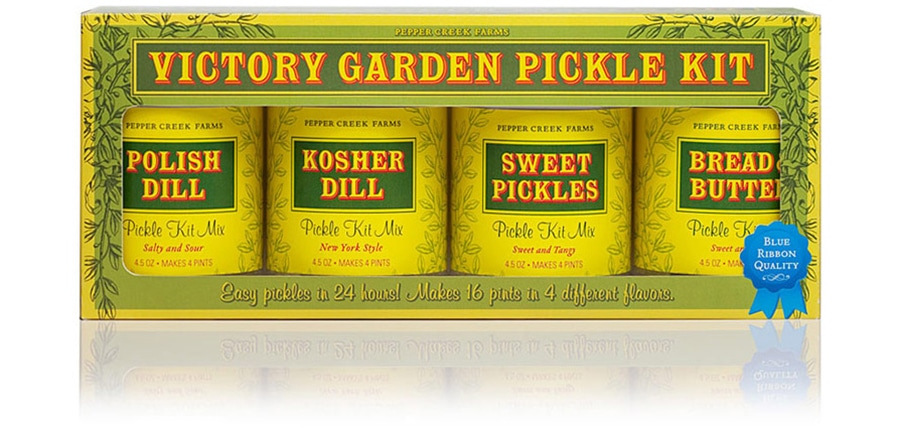
Victory Garden Pickle Kit
We developed a Victorian theme for this pickle kit mix to coordinate with the name as well as to romanticize the easy process of making your own pickles with this simple kit.
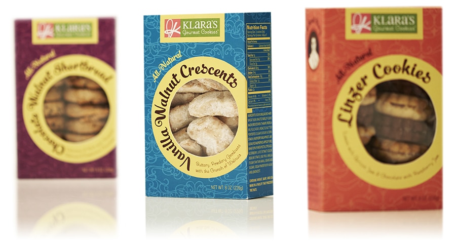
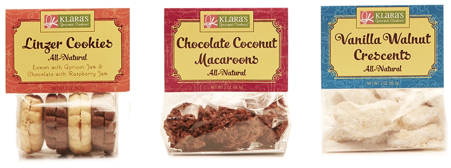
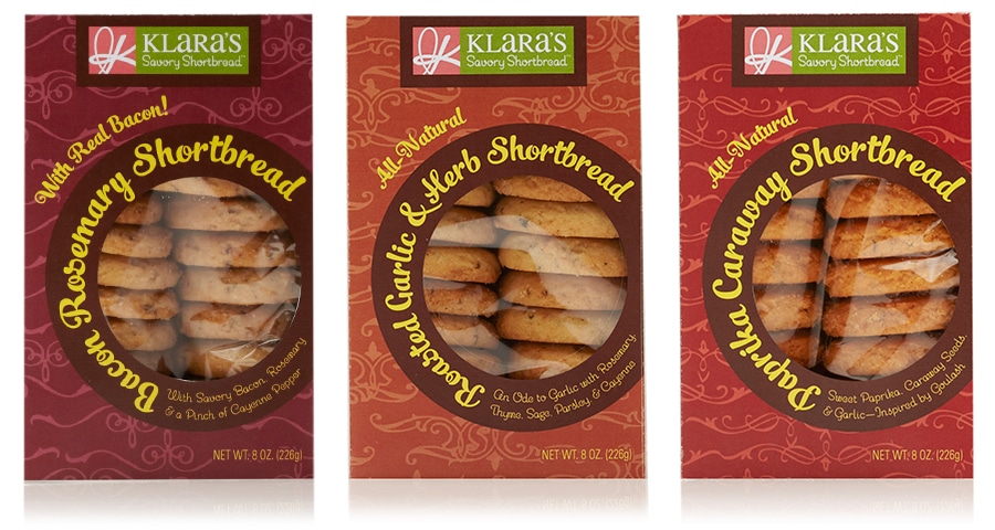
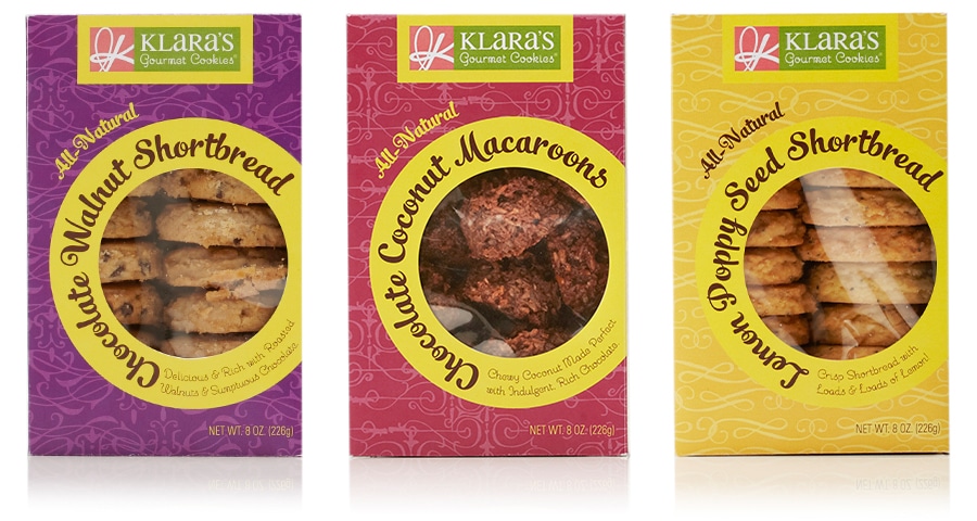
Klara’s Gourmet Cookies
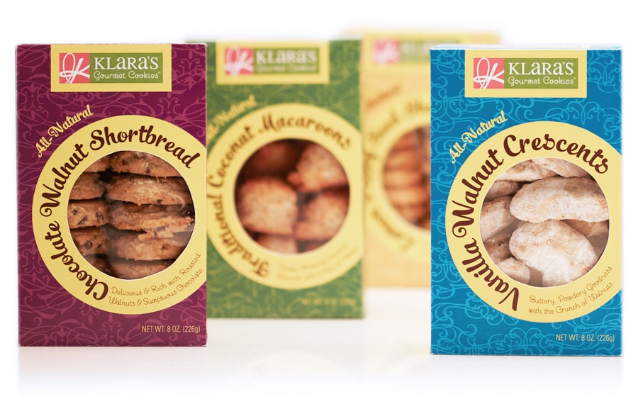
Klara’s Gourmet Cookies
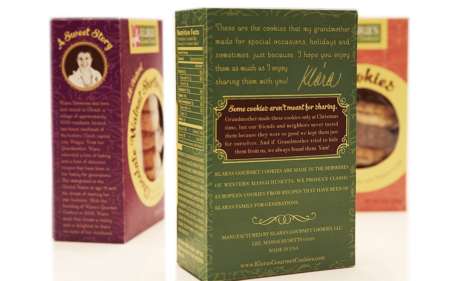
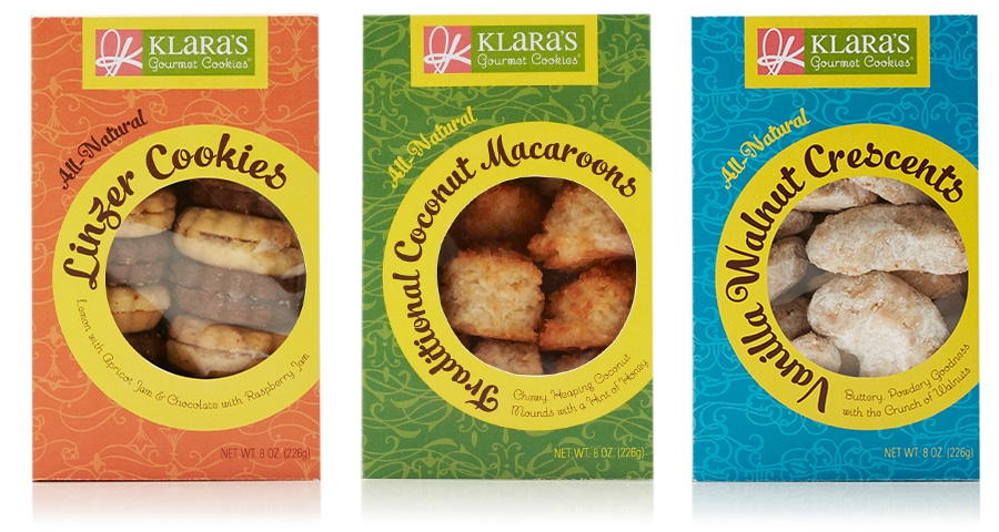
Redesign of Klara’s Gourmet Cookies packaging as part of Package Design Magazine’s Makeover Challenge. Box structure was chosen for ease of merchandizing, protection of product and maximum display space on the package. Circular motif creates striking design that stands out on the shelf, while bold colors convey the fun and whimsical flavor pairings. The subtle background patters are a nod to Klara’s heritage, from which she draws on traditional family recipes in new and exciting ways.
Cookies packaging design and snack box design—yum! With so many snack box designs, snack pouch designs and cookies box packaging design on the shelf, we make your snack or cookie brand design striking and arresting, but also functional and informative so it works hard to sell itself.
