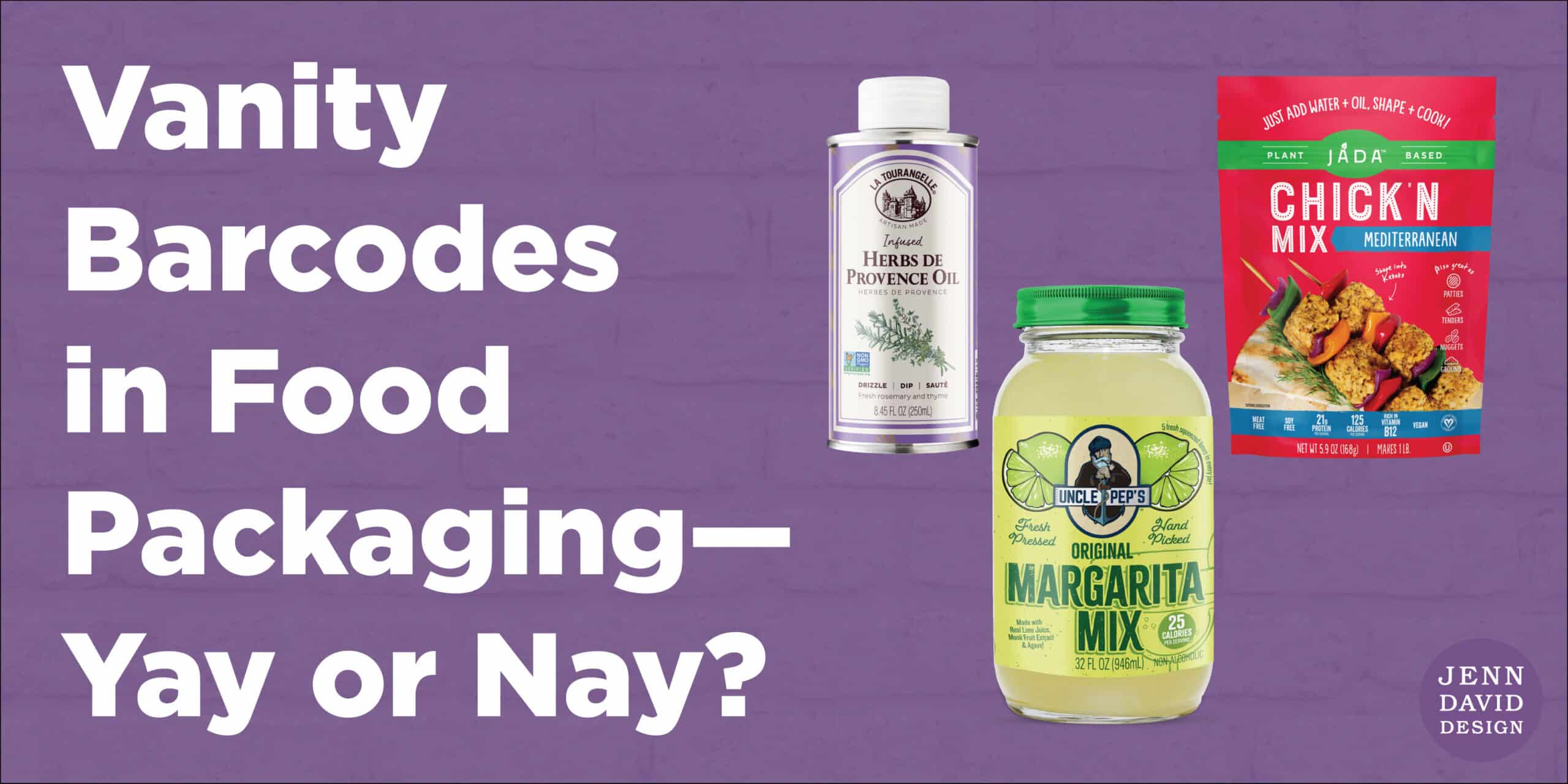
I should have written this article over a decade ago when vanity barcodes first came out. I thought they would fade into oblivion, but they haven’t. Vanity barcodes are most commonly used on food and beverage packaging, however this article applies to any packaging design that includes a barcode. I don’t see vanity barcodes as often now, but I still see enough of them. And every time I see one, it bothers me for a few fundamental reasons. Read on to find out why!
What is a Vanity Barcode?
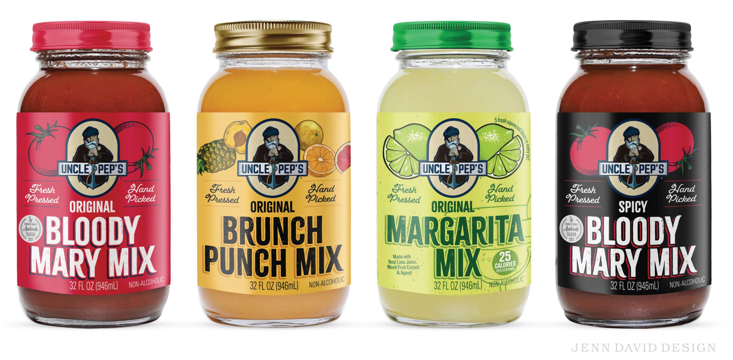
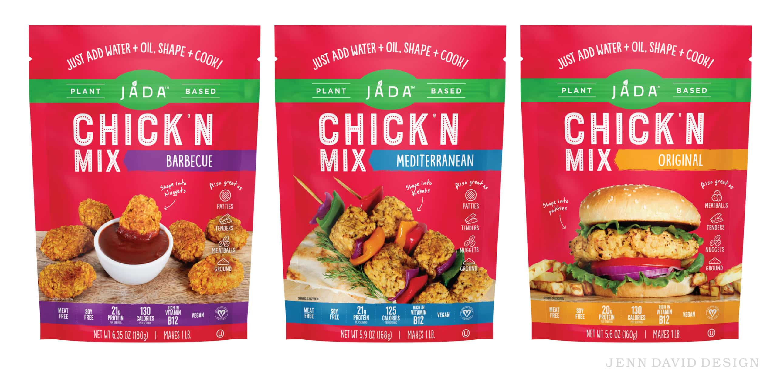
A vanity barcode is a barcode on packaging that has been altered to appear as an illustration or icon. Usually it’s cutesy and related to something about the brand or food product. So it’s basically a little illustration with bars in it that scan to function as the barcode. The numbers of the barcode are also present and sometimes in a cutesy way too. (A quick google image search for “vanity barcodes” will give you some examples.)
Sounds great, right? Why not innovate when it comes to every area of the package? Below I’ll tell you why vanity barcodes are not a sound strategy.

Don’t Mess with Usability in Food Packaging—Including Barcodes.
The barcode on food packaging is incredibly important. If your food packaging vanity barcode does not scan, or scans incorrectly, you will likely have to reprint all your packaging to correct the barcode. A problematic barcode can create a nightmare situation for your relationship with retailers—in addition to wasted product and packaging.
Here are barcode best practices for incorporating barcodes into a packaging design, in order to maximize scannability and usability:
- The barcode needs to meet the minimum size requirement.
- The bars of the barcode need to meet the minimum height requirement.
- The UPC numbers should be below the barcode where they are expected, large enough to easily read, and in the correct order.
- The barcode should be printed in 100% black ink on a white background, for maximum contrast.
- The barcode must have sufficient quiet space around it (meaning space from any other text or distracting elements to the scanner laser).
At checkout, whether as a cashier or as a consumer at self-checkout, it can be hard enough as it is to locate the barcode on a food package, and to scan it properly. If you deviate from the above best practice barcode guidelines, you make it both harder to locate a barcode (sometimes vanity barcodes are almost unrecognizable as a barcode), and harder to scan. Even if technically a vanity barcode still meets most of the requirements and scans, it might not trigger the scanner laser as easily. This can create frustration all around, as a result of the food packaging design.
My number one rule for food packaging design is: Don’t mess with usability, and that includes barcode usability. Barcodes should be easy to recognize, locate, and scan.
Rethink Your Creative Strategy if You’re Innovating via a Vanity Barcode.
Seriously. If you’re relying on the barcode for differentiation, I question your creative strategy. Yes, I get it, it’s like a lagniappe (something given as a bonus or extra gift) in the design—but is the consumer really getting anything out of it? A true lagniappe gives the consumer something memorable and strengthens the brand connection. A vanity barcode just feels gimmicky.
Focus Attention on the Selling Aspects of the Food Packaging.
I’m going to go out on a limb here and say that no one is going to buy a food product for the vanity barcode. Sure, it’s quirky and gets a little bit of attention for being unusual. But why would you want your consumer to focus their attention on the barcode?
Put your creative effort where you get the most ROI for consumer impact. Be memorable for your overall packaging design, messaging, and brand personality—not something gimmicky and purposeless.
Draw consumer attention toward the things that help sell or inform about the food product or brand, such as a strategic callout, key selling point, or informational diagram. Add an unexpected lagniappe in the form of fluffery on a secondary panel of the package if applicable—but in the form of a message or thought.
Memorable messaging and communication are what stoke the brand-consumer connection via food packaging.
In other words: Make your food packaging design strategic to maximize results.
Let Barcodes be Boring.
Given how important the barcode is on the packaging, and the dire consequences and cost that can be involved if the barcode is not scanning properly, it’s best to keep it basic and not mess with the barcode. Bring attention to the important parts of your package—not the barcode, for goodness’ sake. Let it remain a functional part of the design that gets overlooked and ignored, except where it’s needed: at checkout.
(By the way, if you’re looking to obtain UPC codes for barcodes, go to GS1.org.)
Are you ready for a bold, iconic food brand that achieves outstanding success? Get started here.