You can watch this as a video above.
I often see food packages and think “this could be so much better!” It’s hard not to see the missed opportunities—and missed sales—when packaging fails to make an impact. When your food packaging design is bold, distinctive, and memorable, it doesn’t just stand out on the shelf—it drives engagement, builds brand recognition, and delivers real results.
Your packaging is the face of your food brand—and the most important consumer touchpoint. When done strategically, it guides the consumer to buy the product through a series of important steps. But the first step is standing out and getting noticed—all within a split second.
Here, I’m sharing with you my top 4 tips on how to make your food packaging design iconic, to maximize your efforts on the shelf and online.
Tip #1: Find the right food brand design partner.
Food branding and packaging design is a specialized skillset, so you shouldn’t have just any designer working on your food brand. Here’s what to look for in finding the right food brand design partner. One who:
- Specializes in food
- Designs strategically
- Understands FDA compliance
- Leads and guides you
I can’t stress enough how important finding the right design partnership is, and working together as a team. When you combine your expertise with a specialized partner’s expertise, the outcome really transcends what either party brings to the table alone. You know your brand and product best, and when you’re in the hands of a trusted partner, amazing outcomes happen.
Tip #2: Be brave—It takes guts to stand out!
When other food brands are all doing one thing and you’re doing something else, it’s easy to assume you might be making a mistake. But really, it’s a fear of standing out. By “playing it safe,” you’re actually doing the opposite. Blending in doesn’t stand out and doesn’t get noticed.
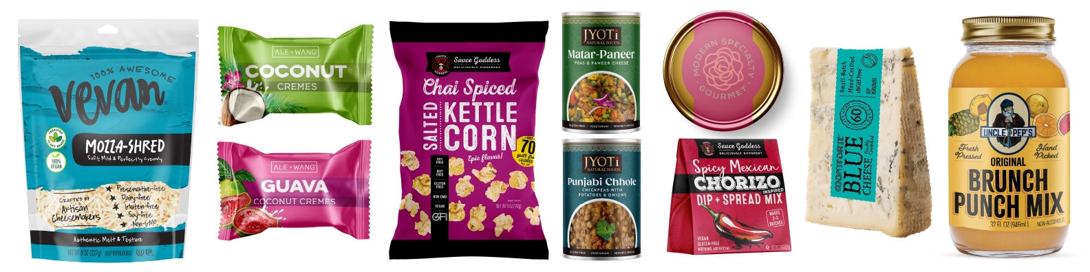
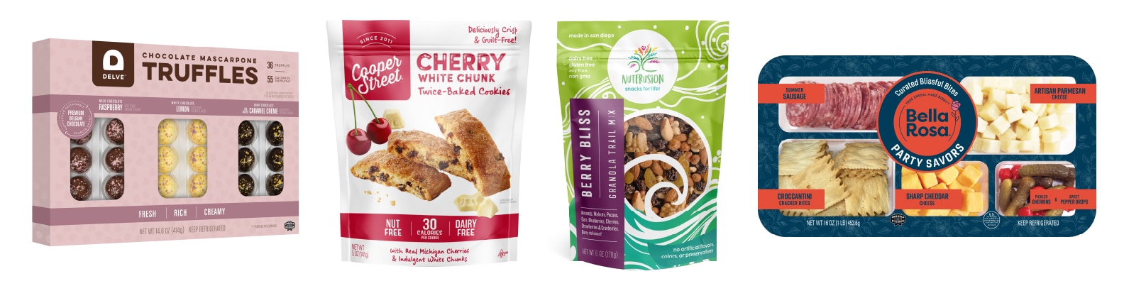
By developing a standout, iconic packaging design backed by strategy, any perceived risk becomes a calculated risk that—in my experience—always has huge rewards. We see it time and time again with the ROI our clients report:
- 60% sales increase in 6 months after a redesign [Whisps]
- Sales doubled after a redesign [Sauce Goddess]
- Business tripled and a local brand went national after a redesign [Lemonette]
- Landed shelf space with a national retailer that quickly requested line extensions [La Tourangelle]
- A new category disruptor that quickly went national [Vevan]
We routinely see that standing out in a strategic way pays off.
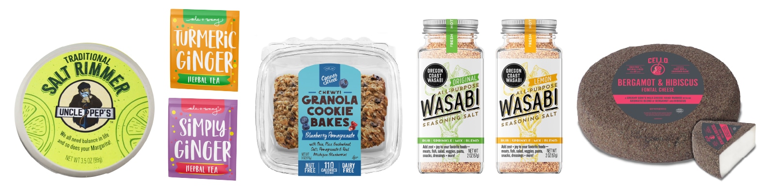
Tip #3: Be authentic! You don’t need to hold back or water it down.
Your food brand’s uniqueness is what makes it interesting and different from other food brands. Its character should be determined by strategy, which informs the design. The words and messaging on the package should carry through the same uniqueness and personality. When design and wording are flat and expected, it’s not interesting to read, and will likely get overlooked. But by being unique and truly authentic, words and design stand out—just like iconic design.
Speak on your packaging in a real way. Keep it fresh, short, and interesting. A helpful exercise is to describe your product the way you would to a friend or someone you just met, then use that as the rough first draft of your descriptive copy. Keep that raw energy of how you described it casually. But always, make it strategic.
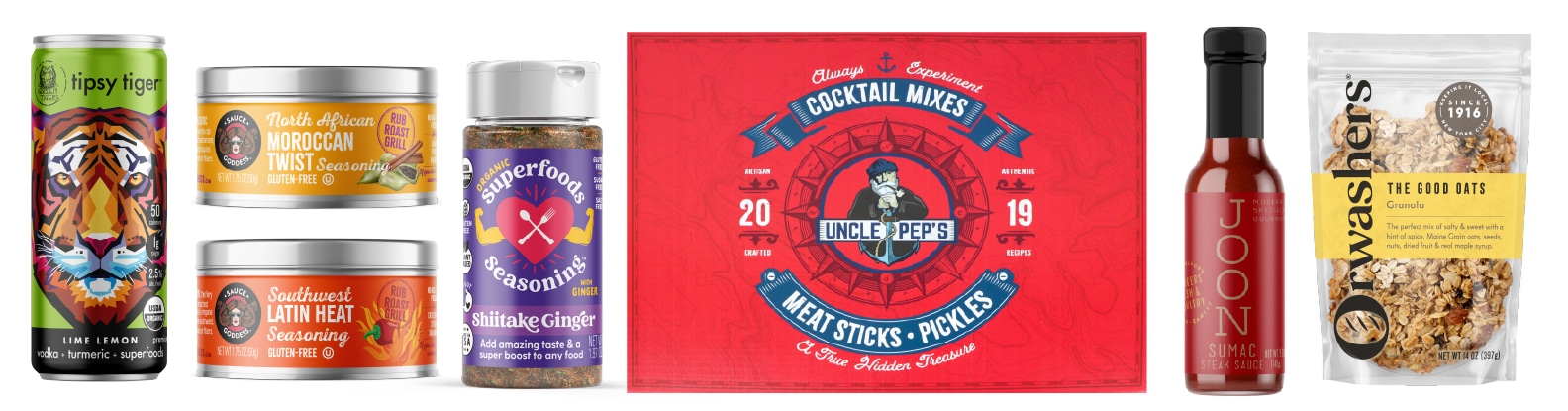
Tip #4: Have a bold focal point, and clear hierarchy.
When your food packaging design has a strong focal point, combined with a clear hierarchy of information, it stands out—and tells the eye what to read, and in what order. When a design is busy, the eye doesn’t know where to go. This is an error I see all too often. It can be hard to tell what the product is, and you have to work too hard to understand it—all within that split second window. It leads to a lost opportunity, and a lost sale.
A similar mistake is putting too much wording on the front or back of the package. Just because you have the space doesn’t mean it should be filled. Just because you put the words on the package doesn’t mean people will read them. And lastly, just because you have a lot of great things to say about your product doesn’t mean they all need to be on the package, or all on the front, or all in the same place.
This is the power of a clear hierarchy of information. Edit down to the most important points, then say it most succinctly. This is especially where strategy comes into play—knowing what works best, and where, for selling a package.
Final thoughts
My last recommendation to make your food packaging design iconic is: make it something you truly love, are excited about, and proud of. Not just what other packaging looks like, or “good enough.” Don’t settle for mediocre, and keep going until it’s amazing.
Interested in discussing what we can do for your food brand? Get started here.